A2 Exam Theme 2013:
Inside, Outside, In Between
Task 1: Brainstorm of Ideas
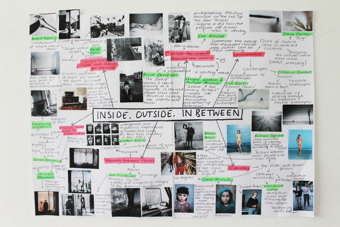
Task 2: Practical
Photographing objects that lead to other places in a literal, literary or surreal way: doorways, wardrobes, portals, key holes, windows, mirrors. Considering how these frame what is inside or outside.
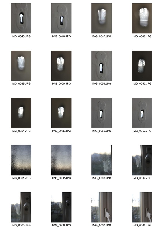
Raw Images
|
|
|
Edited Outcome
|
|
|
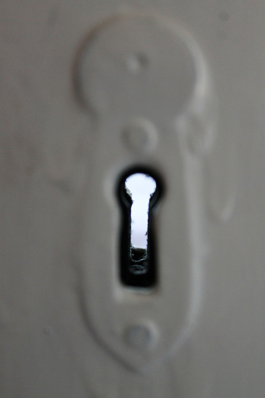
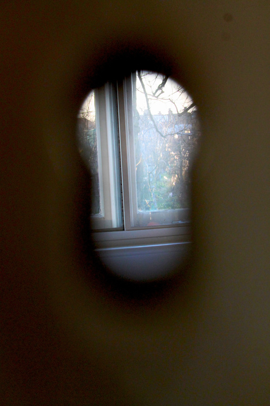
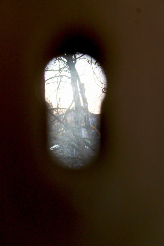
Taking the idea of looking through to the outside. The object of a keyhole, in a literary way that leads to another place and in some cases take you from the inside to the outside. I captured the object itself but also by focusing in on what's through the keyhole creates an element of mystery - makes the outside almost feel untouchable, imaginary. I enhanced the contrast so that the area through the keyhole looks more prominent in the picture and the saturation so that the colours of the woodland through the keyhole again stood out, something that was imaginary. This also, along with the very slight decrease in the offset of the image created an almost burnt out look around the keyhole, as if this beautiful landscape was burning away.
|
|
|
|
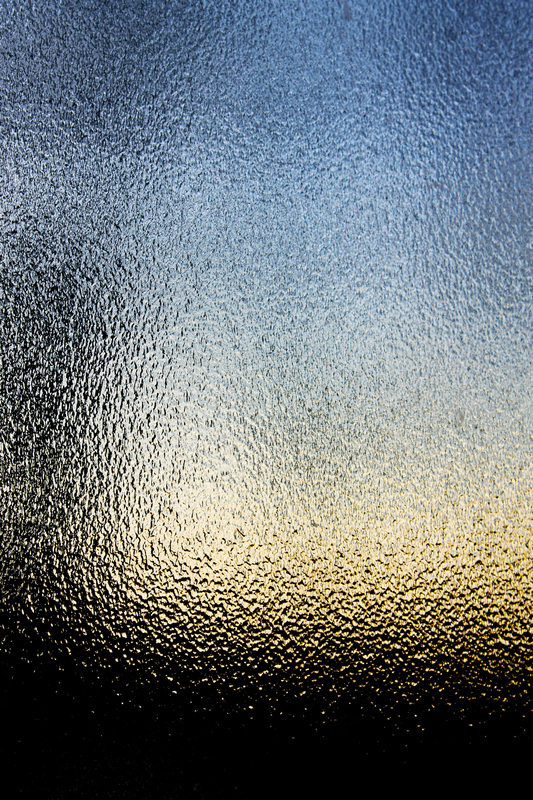
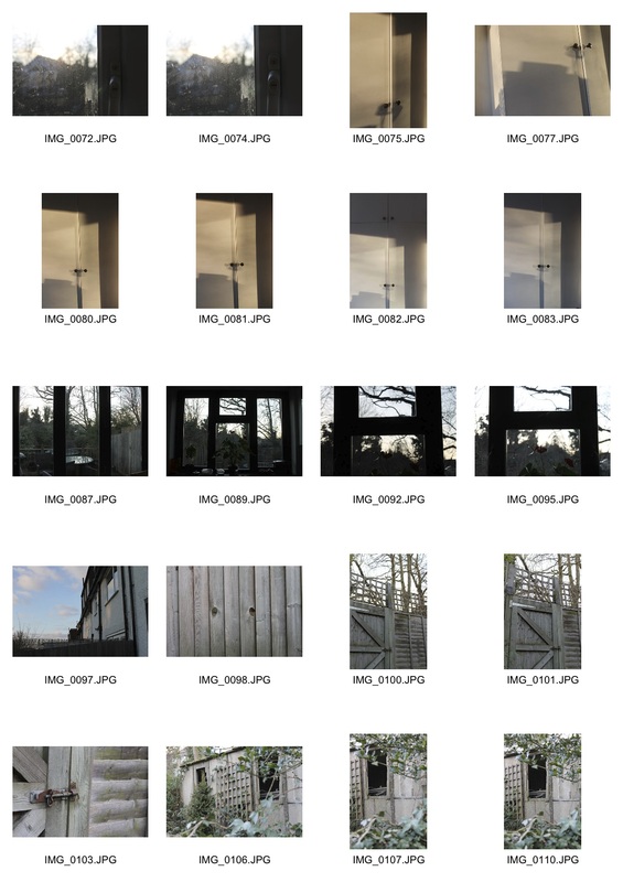
In relation to the theme, the glass in between manipulates and specifically here distorts the outside from the inside. The glass here distorts the landscape and pulls out only the tonal variety in the landscape. I like the pale and warm colours in the image that are fluid into one another and merge well in order to make the landscape noticeable as well as distorted. Through photoshop, I simply enhanced the contrast in order to bring out the different colours and made them brighter and more warm by increasing the saturation and the vibrancy of the tones. The aspect I like most about this image is the distortion, how altering what's between the camera can manipulate or change an image or setting. I also think it makes for a more interesting image rather than just a picture of a landscape and specifically enhances those warm colours that suggest by themselves what's beyond the glass.
|
|
|
|
|
|


Objects that lead somewhere in literal ways, in this case wardrobes. The sunlight that shines across the wardrobe is actually the edge of a window frame but insinuates another place that leads somewhere. I like the symmetry in the images and the tonal variety of the sunlight glaring across the doors. It almost burns what is really there and fractures the image into two different ideas that both lead somewhere in the literal sense; a wardrobe and a window. I also like the simplicity in the image; there is nothing particularly loud or dramatic about the images but just simple yet interesting to the eye. An interesting thought to branch from for my project.


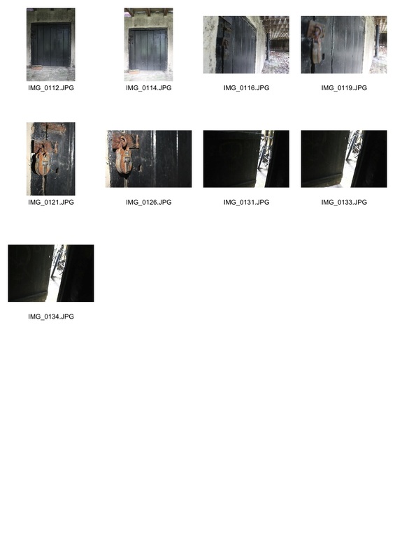
Further documentation and experimentation of objects that lead somewhere in the literal sense. I like how this group of images are all quite cold; almost representing the obstruction between places, the idea that there's something there or beyond that point that you can't get to or see. Bringing out the contrast in these images sharpened to tones and made that divide, specifically in the window frame images, between the inside and outside more prominent. The flash used on the image of the padlock on the black wooden door brightens the image, making it flashy which I think contrast well with the oppressed atmosphere of the image and the forbidden aspect suggested by the padlock and the door. Good experimentation but non particularly stand out as a starting point for my project.
ALTERING RELATIONSHIP WITH THE OUTSIDE
Using gravity as our advantage, my class and I created impossible scenes by photographing them from above.
JAN VON HOLLEBEN
Jan Von Holleben is a German photographer, best known for his series that create scenes or moments on the floor both inside and outside and captured from above. Holleben focuses a lot on perspective and the strong compositions in order to make these images work. I think that by creating moments that would be unrealistic to capture naturally or are from a famous movie or moment in history are more visually interesting and engaging for audience's. I also think that creating a busier composition of the setting is also most effective. His work is highly original and fun for audiences.


RESPONSE - TIME LAPSE VIDEO
Instead of creating single images, my class and I decided to take Holleben's concept of creating a setting/scene further by creating a time lapse - a short film clip consisting of several images each portraying seconds in time taken progressively and then edited as an animation in Photoshop that plays these photos one after the other with no time in between, creating a stop-motion film. I like our outcome and thought it was a good response to Holleben's work whilst still remaining original. Putting music also works well with the film specifically for us to create a calm, nonchalant atmosphere that contrasts humorously with the unlikeliness and unrealistic goings on behind her. Making the composition was fun and interesting and sparked other ideas of what I could create.
GALLERY VISIT - THE PHOTOGRAPHERS' GALLERY
|
LAURA LETINSKY: Letinsky's still life photographs are influenced by 17th Century, Renaissance painting. Her work resembles the aftermath of a meal, where stained tablecloths, spilled wine and squashed, misshapen fruit allude to mortality, frustrate desire and melancholy. In the series III Form and Void Full continues Letinsky's interest in playing with representations of space and time, but departs from the narrative potential of the still life.
How does she use collage to challenge our understanding of balance and perspective, real and unreal? Letinsky has taken an image of the dinner table, cut it out and reformed it back together along with other images that produce the same atmosphere as the original setting in ways that make the image look conjuncted and unreal. She alters the composition of the image in ways that could respond to the same ambience of the actual dinner setting she was apart of. The images are interesting to the eye and lead you to have to not only construct the picture together but also the actual setting and scene of that dinner, therefore engaging audiences. EVALUATE: At first I was interested by the image from a far and I did quite like the context of the series however, I feel the images look messy, unfinished and at times too blank. To me, whether the collages are trying to represent a moment in time, they are almost too decapitated that the objects and their positioning are too all over the place and distanced me as an observer as I felt it hard to understand the image. |
|


ARTISTIC RESPONSE
TASK 3: RESEARCH
Lee Friedlander
'America By Car'
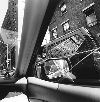
FORM: This is an image taken from Lee Friedlander's, 'America By Car'. Friedlander is an American photographer and artist. This is a black and white image taken from this series that captures New York City in 2002 from the inside of his car window. Friedlander uses the windscreen and side window as a frame within the frame creating a complex composition. There a tall, brick buildings propelling upwards and reflections of other buildings in the window of the car driving past, Friedlander's side mirror and front window. Even in black and white, where the sunlight shines in the car and reflects off of the buildings makes the image bright which brings out the contrasting tonal colours of the image.
CONTENT: The 'America By Car' series, photographed over the past decade, follows his journeys accross America in rented cars. Friedlander refers to his photographs as "social landscapes", an appropriate term for this store of social history. However, there is a clear element of architectural photography, the often suprising sculptural forms to be found in houses and trees etc. In this image of New York City, the lines, reflections and angles are perplexing much reflecting the chaos of the city. As Friedland made his journeys across America, his feelings and the connection he feels with these places is mirrored in the atmosphere that is conveyed through the images. For example, in this New York City image, a sense of claustrophobia and the feeling of being overwhelmed is very much echoed in how the tall buildings present and also reflected create a busy, hectic image, ultimatley producing a similar feeling to how Friedland felt himself. The car's manufactured interior provides an unusal photographic frame for these images, yet it is a viewpoint that will be familiar to almost anyone who has travelled by car making this series relatable and interesting for world wide audiences.
PROCESS: Friedlander works primarily with 35mm cameras and black and white film which is used here to create this image. The contrast between the dark areas and the areas in the image lit brightly by the sun, makes me think that there was no flash used in order to create more tonal variety. Also you would've been able to see the reflection of the flash in the window mirror which would have detracted attention from the more interesting surroundings in the image.
EVALUATION: I really like Friedlander's series as I thought it was both interesting and compelling. As someone not from America, the series gives an honest yet beautiful representation of the landscape and life that he had visited. Some of the images are quite frank which creates a humorous aspect to the series. What is also so engaging to audiences about this series is how most people can relate to these moments driving in a car and seeing things or moments that you will only see for that split second you drive by, which makes Friedlander's series so interesting seeing them captured in front of you. The specific image I chose to analyse was one of my favourites mainly because of the remarkable composition of the image. The reflections and windows and angles of the outside landscape bode well together, creating a visually beautiful and fascinating image. Another aspect I liked in general but is highlighted well through this image is how to a lot of people wouldn't think that capturing an image from inside a car would be at all particularly visually effective, however Friedlander has proved this to be wrong and in fact captured a much more real and authentic representation of what he came across whilst travelling across America by car.
TASK 4: DEVELOPMENT
    |
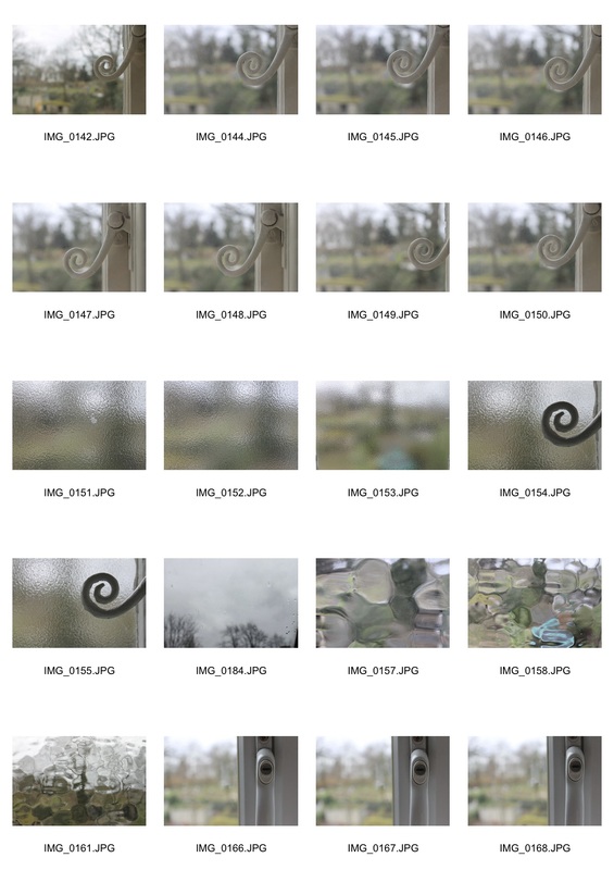
Uta Barth'Between Places'
'Nowhere Near' Uta Barth is a contemporary photographer who lives and works in Los Angeles, California. Her series 'Between Places' (two top images) and 'Nowhere Near' (two bottom images) are both presented as a book. I like the distortion in the images from 'Between Places' and reminded me of one of the images I already took in task 2. I wanted to continue this idea of distorting the landscape and seeing if I could both bring out the tonal variety in Barth's work whilst still keeping it recognisable. In 'Nowhere Near' the I liked the composition of the image what with the frame coming between what's outside and inside and reminded me of a previous image I captured in my experimentation. |
As a response to Uta Barth's work, I wanted to capture the same distorted effect on her landscape shots by focusing the camera to what's nearest to the camera i.e. the window, so that the landscape behind is out of focus creating that distorted look that I intend to capture. Barth also uses windows as frames for the landscape behind and I wanted to experiment with that as well.
Raw Images
|
|
|
Edited Outcome


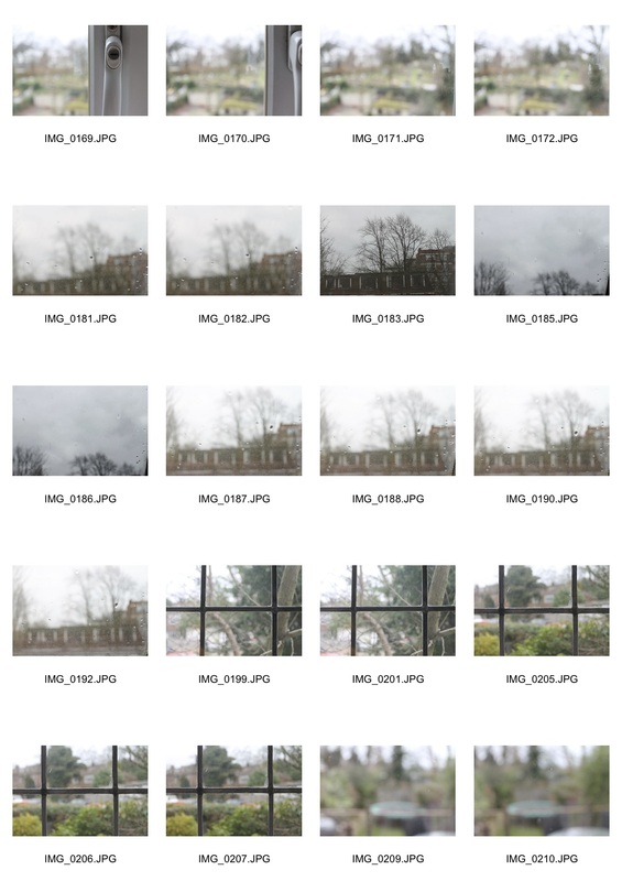
I like the distortion of the landscapes in the last few images. I think the tonal variety is less within these images because of the light of this particular day but I still like how the landscape and setting is recognisable. Attempted to bring out some of the tonal variety when editing in Photoshop but didn't want to then have to compensate with having the greens and darker shades being bright and harsh and not blending with the rest of the image. The third image is actually the type of glass on the window that gives it that texture but I thought it was interesting and still distorts the landscape behind it. The first two images with the window handle I also like with the way something is in focus in the image unlike the last two. However for creating distortion, the handle almost gives it away and leaves the audience knowing what the landscape is and therefore maybe a less interesting image. As a response to Barth's work, I think they are closely related but still hold some of the original ideas I wanted to obtain. The images could have worked better if they were taken on a nicer day either at sunset or sunrise where the colouring would have been more beautiful and less dull.
BLACK AND WHITE DEVELOPMENT


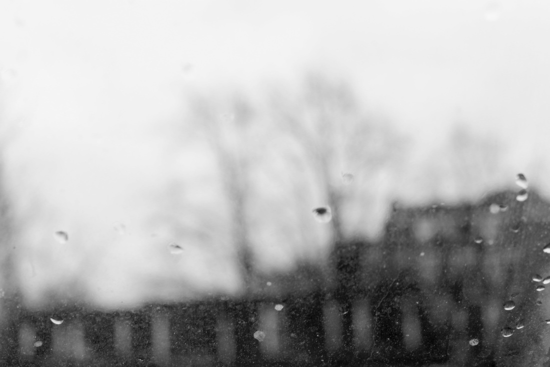
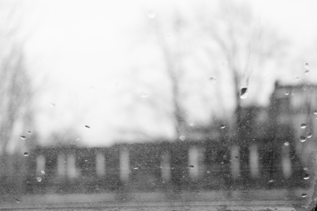
I think the outcome works much better in black and white because of the bland tone but also because they add a kind of melancholy, atmospheric aspect to the photos. Specifically the last two, combined with the rain drops on the window. Those last two are very much distorted and the background is almost completely blurred so I believe the photo heavily relies on the atmosphere that is enhanced by the rain and the black and white editing.
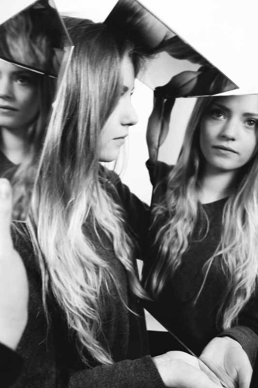
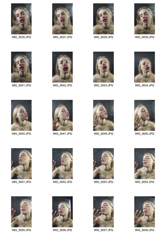
REFLECTIONS
This was a class task to complete but I also wanted to experiment with mirrors as a way of continuing this idea of distortion I had previously mentioned. I wanted to take it away from the landscapes because I though it would be more interesting using the face and the figure. I thought the glass would be a good way of manipulating the body parts therefore distorting them and would be a good starting point into my project.
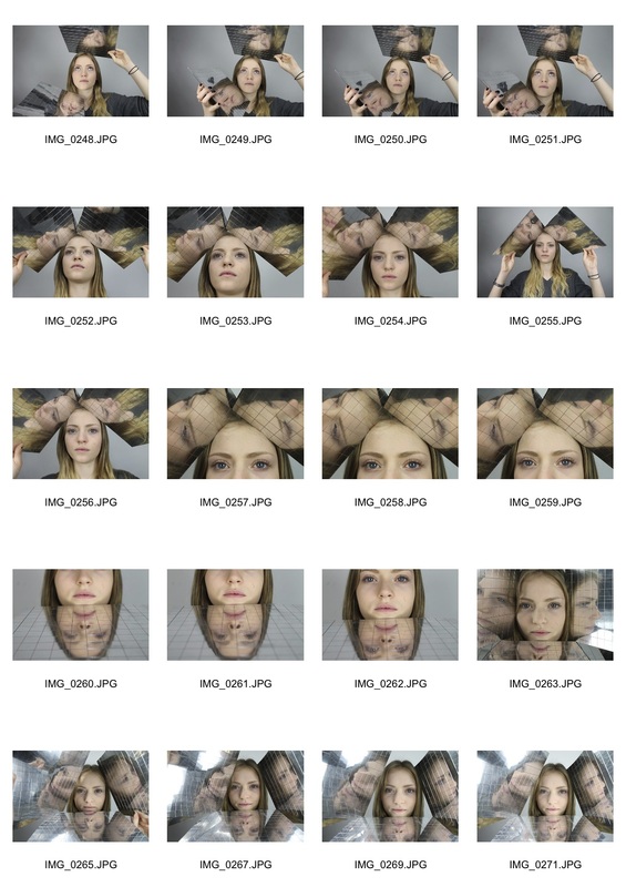
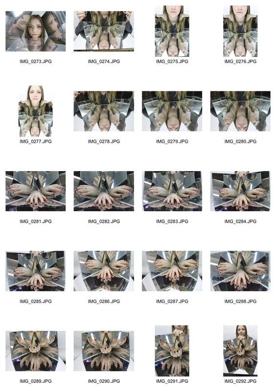
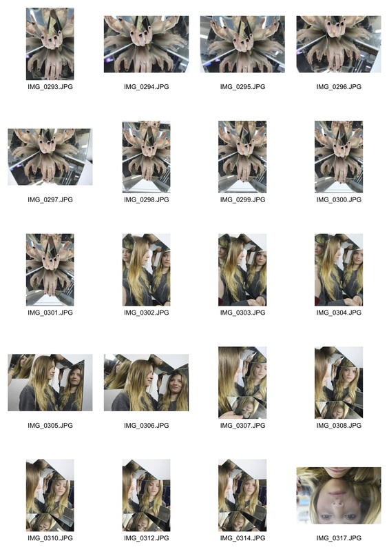
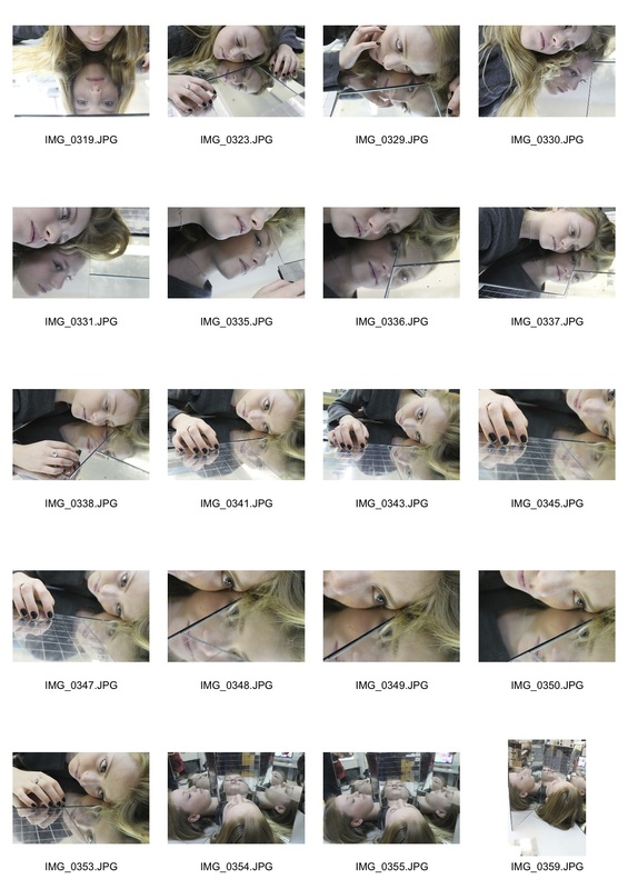
RAW IMAGES
|
|
|
|
|
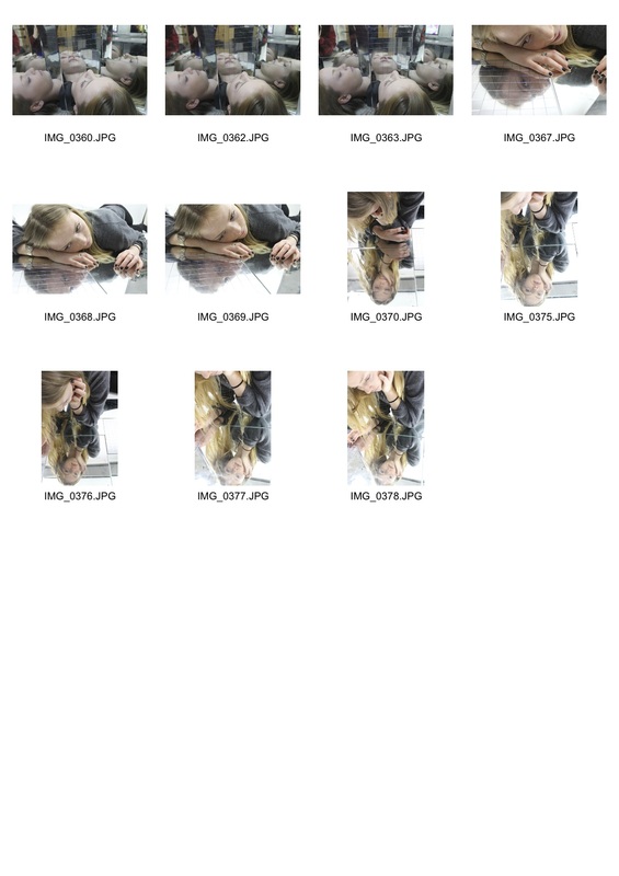
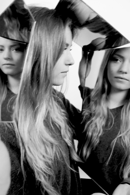
EDITED OUTCOME


|
|
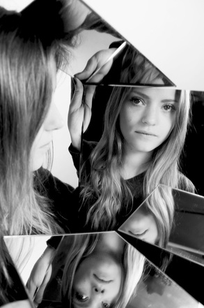


FORM: Reflections of mostly the face into several different mirrors, creating a variety of angles and interesting compositions of the face.
PROCESS: Using the studio, I held various different mirrors around the face in order to experiment with where the reflections were most effective in altering and distorting the face. Tried different angles, such as lying down to see what would look most striking, In the editing process, I changed the mode to grayscale because I thought the contrasting tones in the original images didn't blend the different reflections as well together. Slightly enhanced the contrast in order for her facial features to be more prominent against the white background but in general simple editing.
CONTEXT: My aims were to experiment with how the idea of reflections can distort or deform the face or body when reflected into different segmented parts. I wanted to see how I could create an alternative way of looking at the face and see if the distortion within the reflections helped bring to the eye elements that you wouldn't notice naturally.
EVALUATION: Quite a varied outcome, lots of experimentation but ultimately interesting. I liked how the face looked when multiply repeated across the different mirrors, especially the effect this had on her eyes as when she didn't seem to be looking in one side of the mirror she would be in another. The last four images with the face closer up I liked the most; the eyes of the figure stand out more and almost seem to lure you in. I believe there is something quite beautiful about the image with face being reflected very simply and this is an aspect I want to develop further through to my next outcome.
DEVELOPMENT
The idea of distortion from the reflections I wanted to achieve further. I took inspiration from both Jenny Saville and Bill Viola for my next experiment.
|
JENNY SAVILLE
A contemporary British painter, best known for her large-scale painted depictions of naked women. "Saville rose to prominence with a series of paintings that suggested a measuring, marking or constricting of the female form." The effect of this created a very distorted and contorted figure. By having her model's press their faces or flesh against the glass disfigured their natural appearance, contorting what's on the outside. What struck me about some of the paintings was that to me they had an under-water look to them because their skin looked to dis-coloured and almost dead. My intentions in my response was to produce a similar feel to this. http://www.modernartoxford.org.uk/whats-on/jenny-saville/about/ |
|
|
|
BILL VIOLA
Bill Viola is a contemporary video artist. He is considered a leading figure in the generation of artists whose artistic expression depends upon electronic, sound and image technology in New Media. His work focus on the ideas behind fundamental human experiences such as birth, death and aspects of consciousness. The underwater images that inspired me for my works, Viola captured as a focus on his experience of almost drowning as a child. For me, I specifically liked the movement of the water surrounding the figure that distorted the figure, something that I've been wanting to achieve in my experiments. |
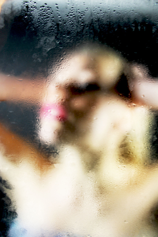
RESPONSE
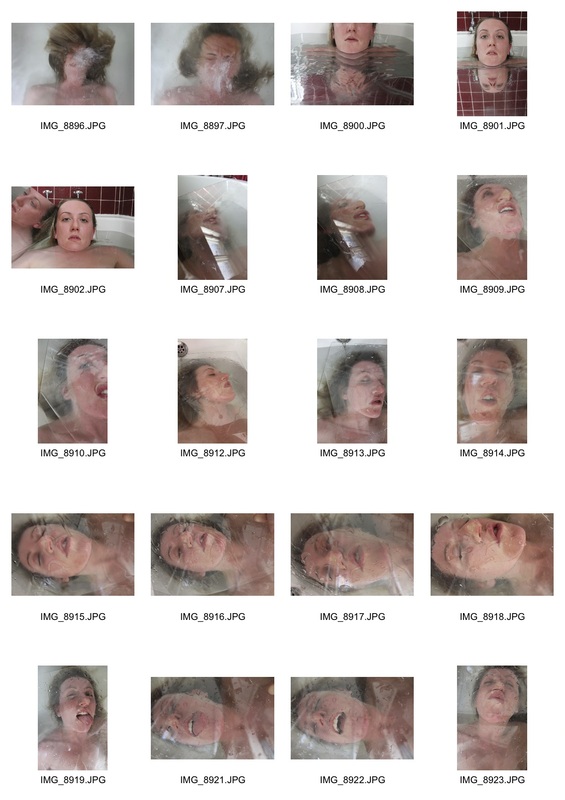
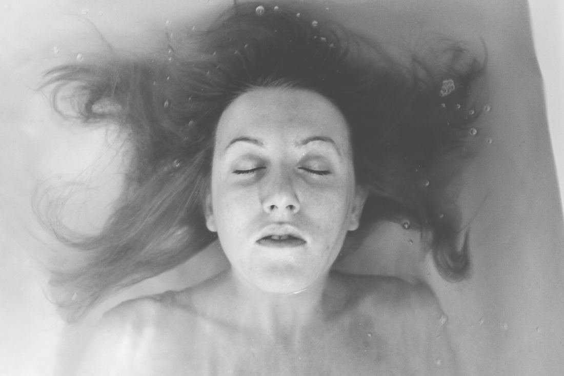
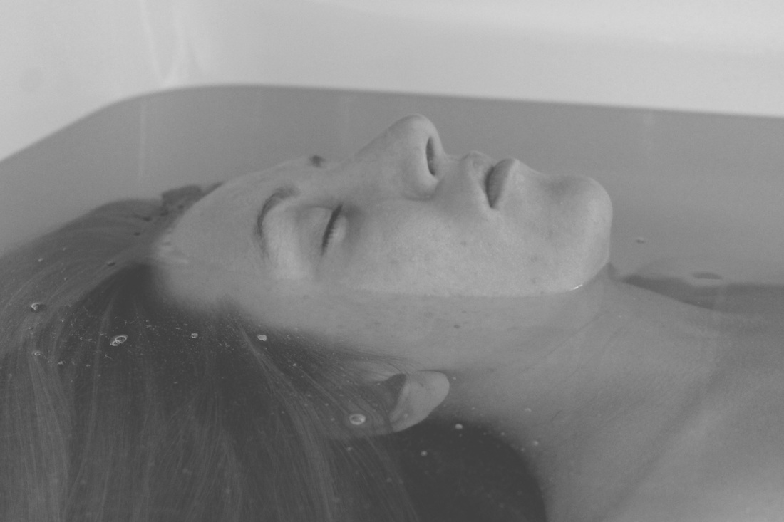
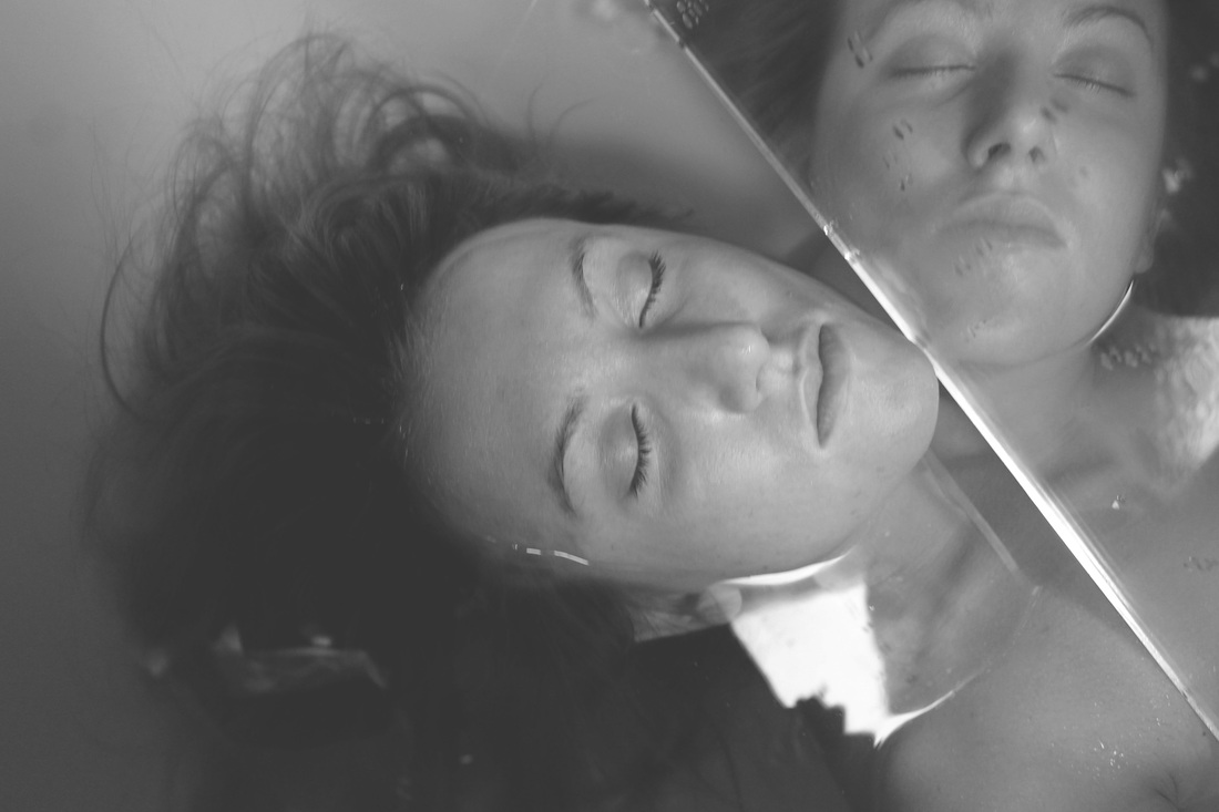
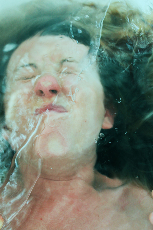
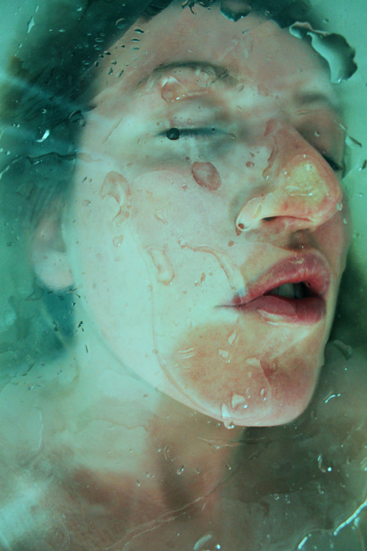
For my response, I wanted to experiment with using both a mirror in water and also a piece of glass. My intentions when using the mirror and reflections were to uphold a similar angelic and beautiful yet distorted aspect that I achieved in my earlier work using reflections. The cold and dead like atmosphere from Bill Viola's work inspired me for this specific idea and I wanted to use the fluidity of water and the floatation of the body to my advantage to achieve this intention. I also used a piece of glass whilst I was in the water in order to use as a way of pressing my model's face against it to create the distorted look in Jenny Saville's paintings. Again, by having my model in the bath I thought I would have the added benefit of the motion of water and the bubbles that would enhance the distortion of the figure.
RAW IMAGES
|
|
|
|
|
EDITED OUTCOME


|
|
|
In the editing process of these images I first changed them to black and white as it reduced the harsher tones in my model's skin that made her look corpse-like that creates an ethereal beauty.
|
|
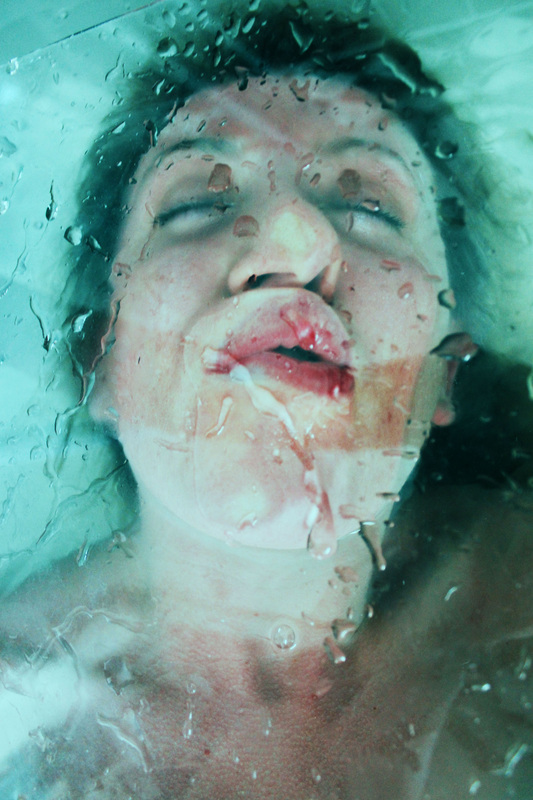
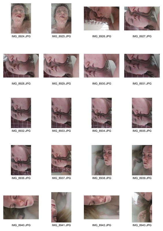
The last three edits used a piece of glass squashed onto the model's face whilst in and under the water. I like the contrasting tones in the model's skin when her skin is squashed under the glass that I brought out in photoshop. Similar to Saville's later works exploring the boundaries between the state of the body, medical and social categorisation and between life and death, in my edited outcome the distorted figure has a look of death about her. In photoshop I brought out the 'cyan' colouring in the colour balance, that enhances the blue tones. Not only do those reflect the colour of water, I also like how they give the images a sterile, bleached look that compliments the distorted and absurd theme.
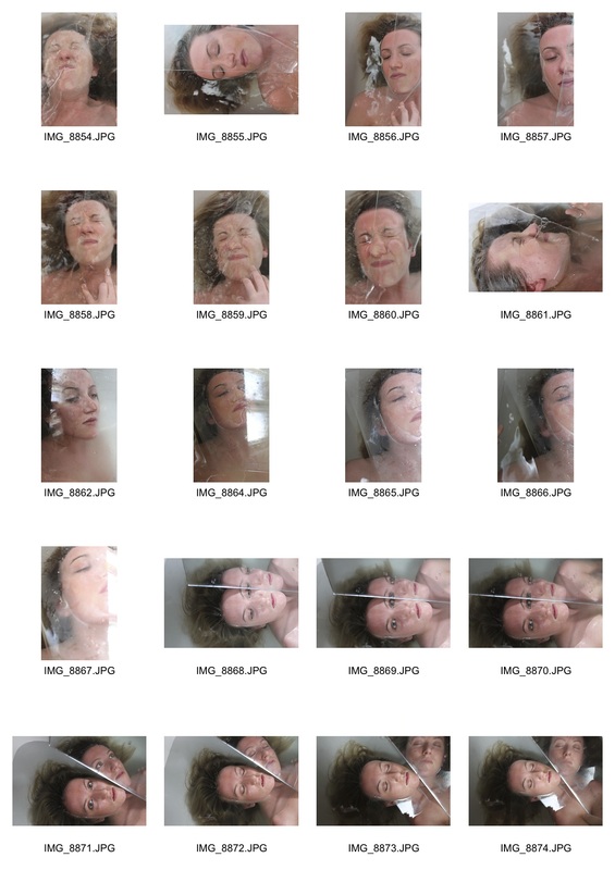
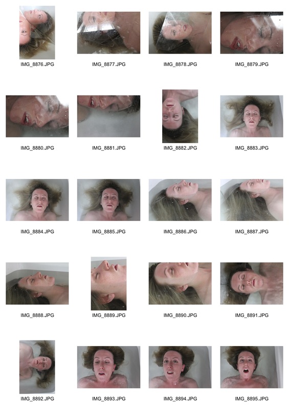
Development - What struck me most about the underwater shots was how in my final edited outcome and analysis, branched two different ideas. One being the lifeless yet ethereal beauty that came from the figure lying in the water, using the mirror and reflections, the other being the distorted, striking, almost ugly beauty that came from pressing the face against the glass with the splashing water. Both ideas however, I felt worked best as portraiture shots, specifically beauty or head shots. Therefore, in order to develop my experimentation, I wanted to combine both of these ideas to create the idea of 'Ugly Beauty'. In relation to the overriding exam theme, 'Ugly Beauty' consists of distorting the outside, appearances, what's real in a metaphorical way and in a literal way by using an actual element in between the lens and what an audience would see as 'beauty'.
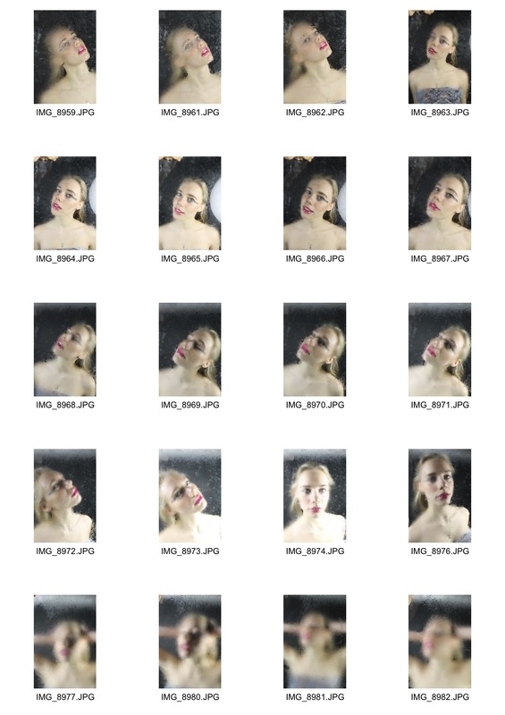
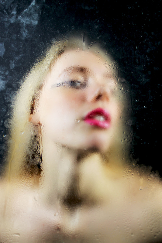
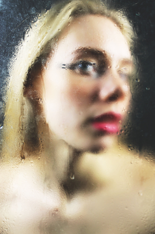
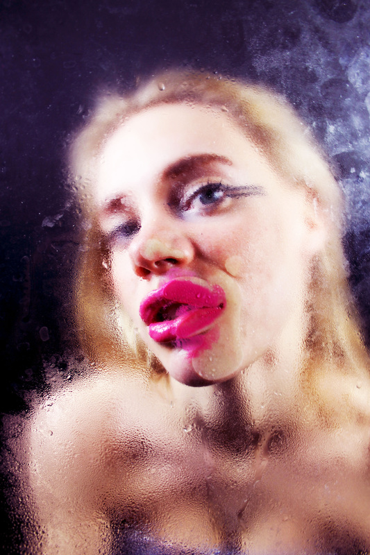
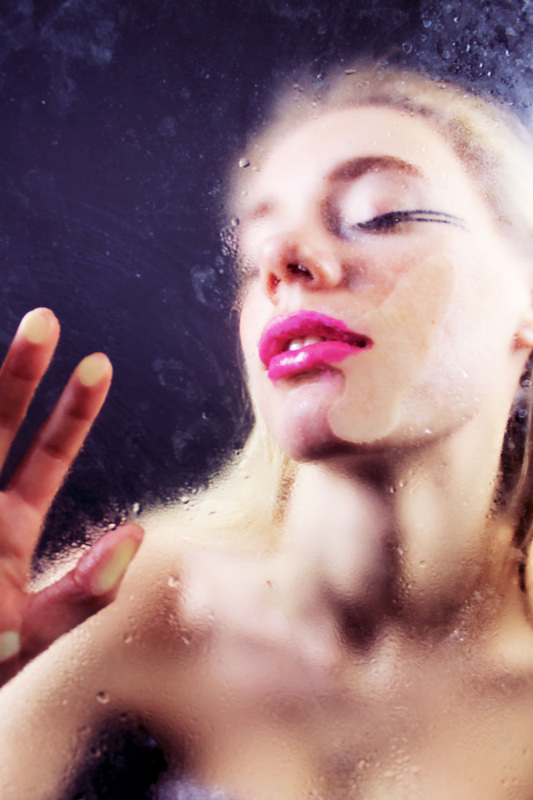
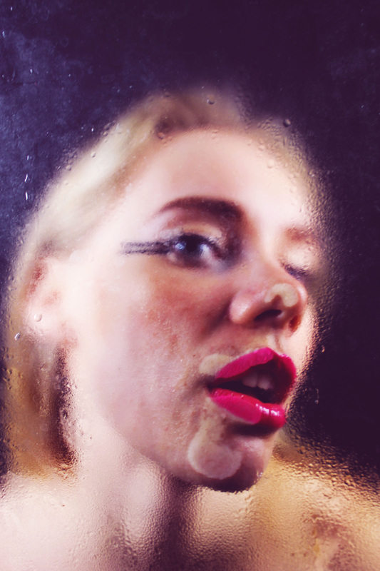
STEAM SHOTS - My first development, I used a piece of glass that I steamed up with boiling water and held it between the lens and the model. I used striking make up on the model to create this essence of beauty and to also make her stand out behind the glass. My direction was for her to be glamorous and use quite over the top, exaggerated posing.
RAW IMAGES
|
|
|
|
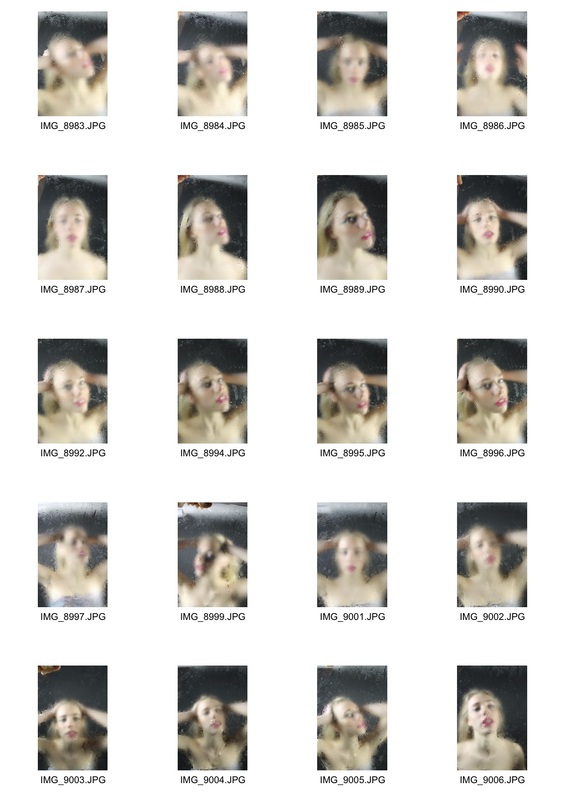
EDITED OUTCOME
|
|
|
These first three edits show mostly the distortion of the face by the steam. Enhancing the contrast helped the two different textures of the models face and the moisture of the steam stand out.
|
|
|
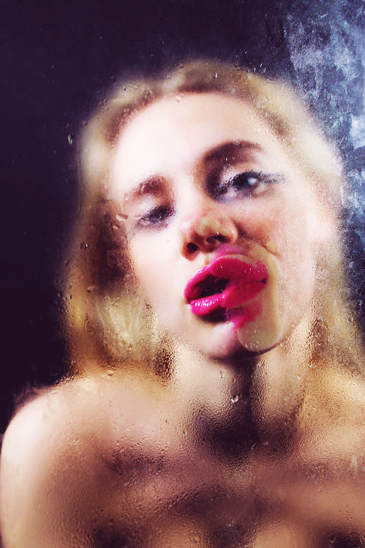
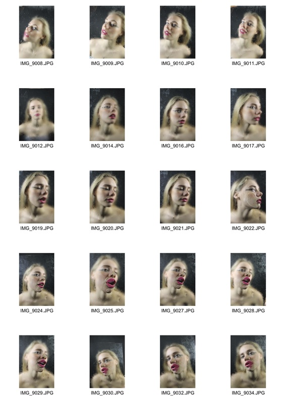
FORM: Set of portraiture shots or beauty shots exploring how the figure can be distorted in order to manipulate the form of beauty.
PROCESS: Taken in the studio space, I used a piece of glass that I held over a boiling kettle in order for the glass to steam up. I then, for some of the shots held the glass up in between the model and the camera and directed my model to exert a sense of glamour by posing in an over the top, exaggerative manner. For the other shots, I had the model hold the steamed up glass and press her face against it. I used striking, bright and glossy make up in order to enhance the glamour and sultriness that I wanted my model to exude. In the editing process, I as shown enhanced the contrast and brightness of the image in order for her features to pop out of the image. I then very slightly reduced the offset to create a more harsher colouring and texture and then heightened the vibrancy so her lips and colouring would stand out. Finally, I decided to change the overall colouring of the image to create a more pinky, glamorous tone.
CONTEXT: My aims were to develop this idea of 'ugly beauty'. I wanted to distort what's real, take something beautiful and change its outer layer by altering the space between her and the camera. I wanted the images to be striking and eye-catching to an audience. I wanted to focus mainly on the face and stick to head shots of the model. In further thought, I wanted to propose questions like; How far can I distort the model until she just becomes unrecognisable? Not beautiful anymore? Would these images change an audiences perception of what's classically beautiful? Is the norm of beauty boring?
EVALUATION: The colours and textures of the images are my favourite part about them. I love how the steam creates a really moist texture in the photo and highlights the dirt on the glass that makes the photos more gritty and harsh, enhancing the ugliness of beauty. I love how the make-up stands out and is made to look even more glossy by the moisture of the steam. I also like how when the model is pressing her face against the glass, that part of the face looks in focus compared to the rest which enhances the distortion I wanted to create. On the other hand, I feel these images could be taken further. Although they are eye-catching and interesting, I feel that the face isn't as distorted as I could make it and could be taken to greater heights in order to really push my idea of 'ugly beauty'. I want to find something where I could really manipulate the face, completely change it and see if the beauty still remains.
DEVELOPMENT
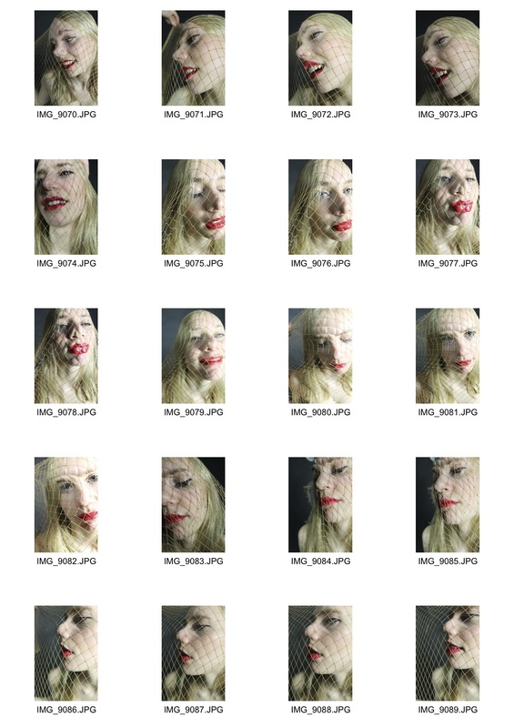
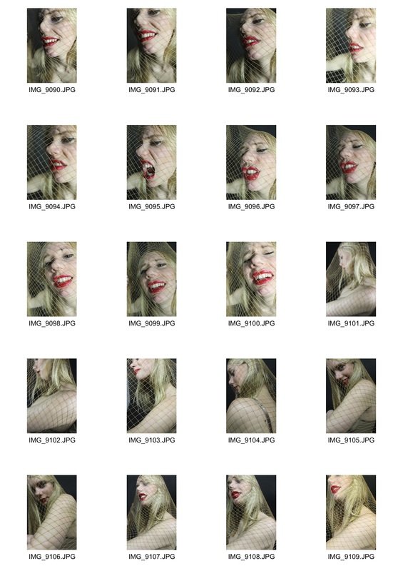
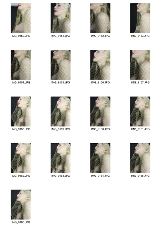
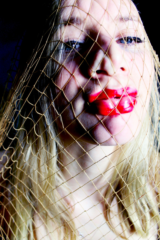
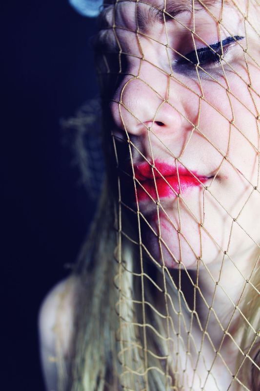
From the outcome of my last experiment, I wanted to take the distortion further and really alter the figures face. I thought of objects and materials that I could use between the model and the camera that would achieve this. For my next experiment I took netting as the material and used it to wrap around the model, pulling it taut to manipulate her facial features. I also wanted to experiment using more of the body and look into shooting her upper body as well as just her face. I wanted to keep the same glamorous make-up from my other shots. For this experiment, I took inspiration from a photographer called Wes Naman.
WES NAMANWes Naman is a new mexico-based photographer. His series 'Scotch Tape' inspired me in the way he used tape to manipulate the figures face creating an absurd, almost unrecognisable form of themselves. I like how Naman has also stuck to portrait, head-shots of his models, as have I in my outcomes. Although this idea inspired me for my next outcome, I didn't want to obtain in my images the humorous quality that Naman's hold. Also because my model remains the same throughout, it made me realise how it is important for me to change my angles and positions in order to get more variety in my outcome.
|
|
RAW IMAGESFollowing on from my last outcome and taking inspiration from Wes Naman, I decided to use netting as a way of manipulating and distorting my models face and figure. I wanted to hold the netting extremely taut so that when she pressed her face and body against her skin and fat would bulge through creating an abstract and distorted form of her figure. I wanted to maintain the same glamorous make-up as it is the underlining and a stereotypical aspect of beauty that I want to sustain throughout in order for these images to represent the 'ugly beauty'.
|
|
|
|
|
|
EDITED OUTCOME
|
|
|
|
|


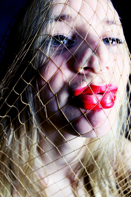
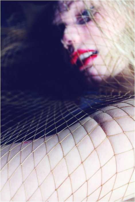
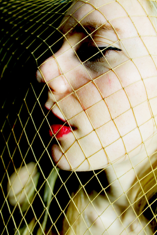
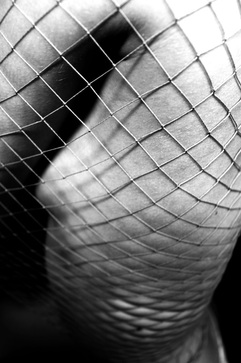
FORM: Netting material used to distort and physically manipulate the figure in order to create a portrait series of abstract beauty.
PROCESS: For this process, I again used the studio space and lighting. I had my model standing or kneeling whilst she and I pulled the netting so it was taut and wrapped it around her face and body. Unlike the glamorous posing in the previous experiments, I directed my model to relax into the netting as much as possible so to let her features bulge through. I did quite striking make-up that would stand out and make my model look even more absurd when bulging through the netting. One difficulty that I met, was that at times the netting was not taut enough because there was only me and the model at times in the studio therefore pulling the netting whilst taking the pictures was at times difficult. In the editing process, overall for all the images I enhanced the contrast so that netting would stand out against her skin and enhance the look of the bulging. I also enhanced the vibrancy and made the images more sharper or harsher where I felt needs be. The colouring is different on the last few images as I felt by bringing out the more pinky, fleshy tones of her skin worked well against the netting.
CONTEXT: My aim for this outcome was to continue my theme of 'ugly beauty' but take it to more of an extreme than previously and use a material to physically manipulate her features. The 'beauty' aspect of the shots is still present through my use of make-up and the look of the model but the absurdity and distortion of the model highlights this contrasting 'ugly' look of the images.
EVALUATION: Overall, my outcome is varied like I intended it to be. As for the first three images, I like the extremity within the image and have really manipulated and distorted her face completely. There is something quite uncomfortable about the images and the are very striking to me. As for the last few images, what I like the most about these is how by bringing out the pinky, fleshy coloured tones in her skin makes the images look even more absurd to the point where she almost looks like meat and the way raw meat is packaged. This was something that I didn't particularly try to achieve with this outcome but inspired me for further developments. I also like the look of these images not being just of the face like I have been doing before. Including the shoulders and back and taking them from a side profile, I feel makes the images more subtly absurd as the audience are left wondering what or who this is. An improvement that I would consider would be using a model with more fat on their body so that the flesh would really bulge through the netting.
DEVELOPMENT
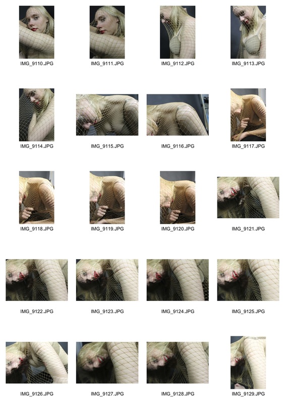
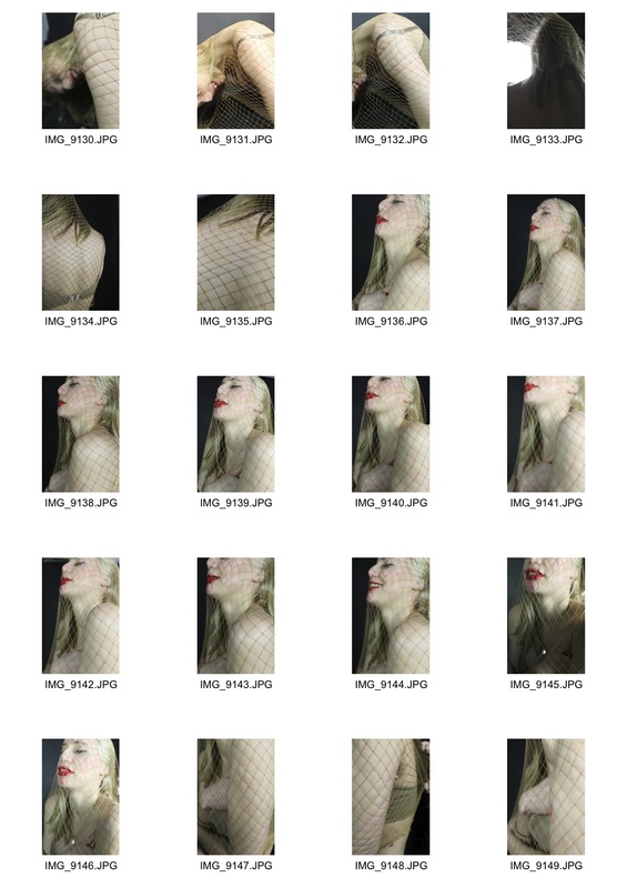
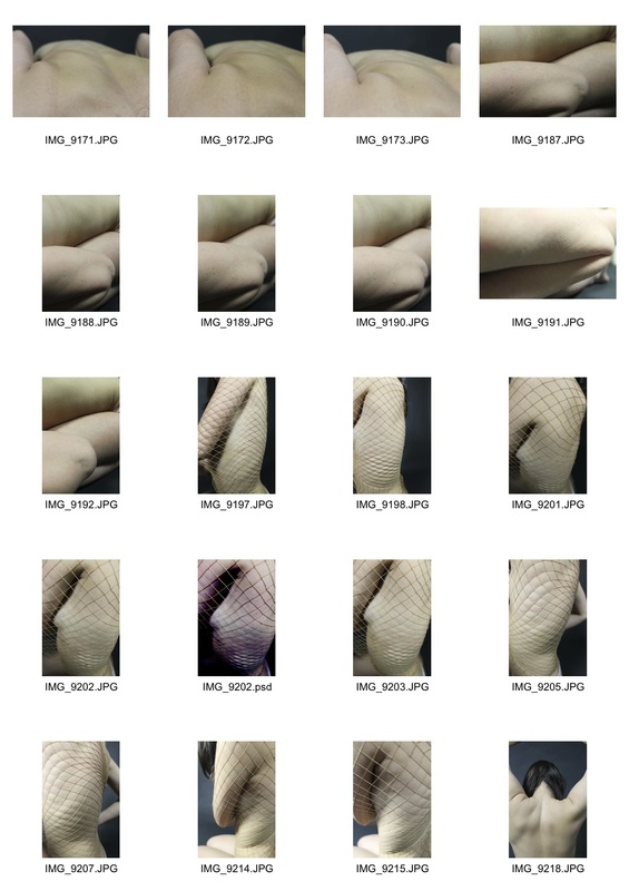
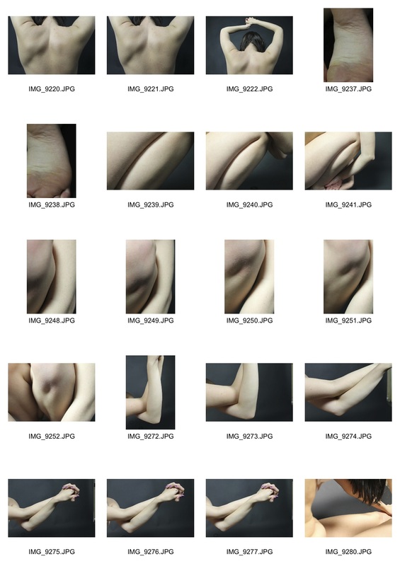
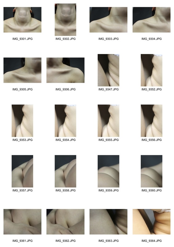
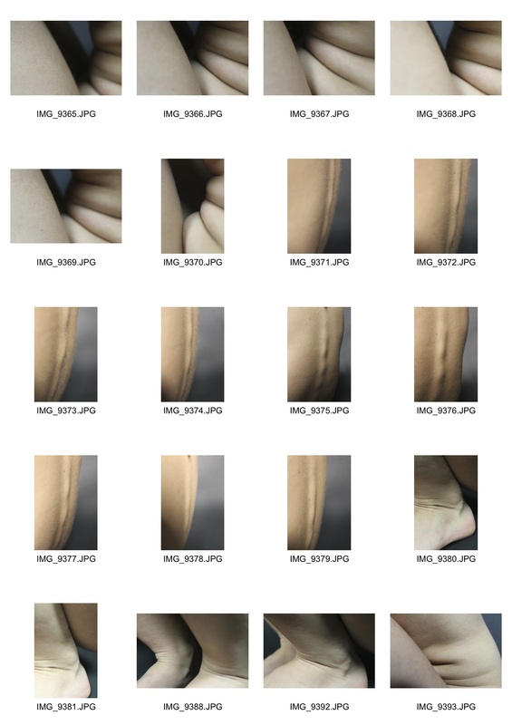
For a further development, I wanted to continue using the netting as a way of distorting the flesh and manipulating the figure but I wanted to explore how I could use with other parts of the body and not just in the face. Therefore, for my development I wanted to experiment capturing other parts of the body and see how I can use both the netting and my angling and perspective to distort the figure. I want to capture each body part separately close-up, so that it looks like something completely different to what it is. Therefore, if executed well I would still be achieving my intentions of creating distortion and absurdity in the figure. I had previously been exploring the concept of "Ugly Beauty" but as I now progress I wanted to develop that idea more in the sense of "Beauty in it's Ugly Form". For this, instead of creating beauty and distorting it like my previous outcomes where I glamorised the model with make up etc. and pulled the netting over her or having the face pressed against glass, I wanted to take something naturally beautiful, such as the form of the human body and distort it in ways that are more subtle. By this I mean, instead of physically distorting the figure, capture it in ways that make it look like something different, create confusion but ultimately more interest for an audience as I engage them with having to figure out which body part is what.
BILL BRANDTBill Brandt was a German-British photographer and photojournalist. He experimented with photography of the nude in the 1930s and early 1940s. He published 'Perspective of Nudes' in 1961. It featured nudes in domestic interiors and studios and on the beaches of East Sussex and northern and southern France. He used a Superwide Hasselblad for the beach photographs. In 1977-8 Brandt added further nudes, published in Nudes, 1945-80.
'Instead of photographing what I saw, I photographed what the camera was seeing. I interfered very little, and the lens produced anatomical images and shapes which my eyes had never observed.' - Bill Brandt. In relation to my work, I was inspired by how Brandt distorted the body by capturing the figure close-up and in alternative and varying angles. I liked how Brandt used the perspective of the outside scenery in order to distort the figure even more. |
|
|
|
EDWARD WESTONEdward Weston was a 20th century American photographer. He has been called the "one of the most innovative and influential American photographers". His nude images inspired me for positioning of the figure. He captures them simply but also works a lot with the natural creases and bends of the body that are simply beautiful but when captured in this way, absurd and distorted. His black and white imagery as well I like as he brings out almost the metallic-like tones in the skin which I think is interesting. The last image in my slide show is named Pepper No. 30 and I added it to my selection of his images because although not actually a body part, but in fact a green pepper, I still liked the way in which he captured the vegetable so that it almost resembles the flesh and figure of the human body. This is very much enhance but the rich black and white tones combined with the strong illumination from above that distorts the pepper into something that looks completely different, similar to my intended effect I want to achieve with my next outcome.
|
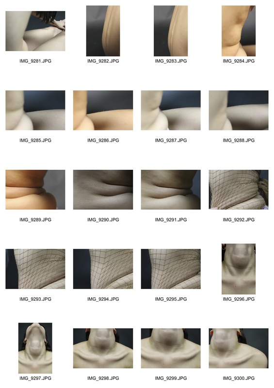
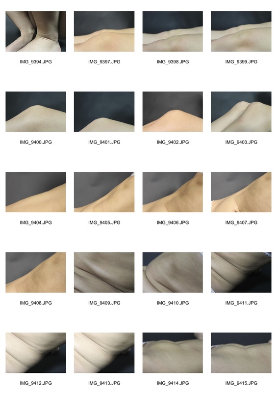
RAW IMAGES
|
For this outcome I wanted to distort the human figure by capturing it from alternative angles and levels, similar to the work of Brandt and Weston. As direction for myself, I intended to detach the different limbs when I photograph them in order to have a varied outcome. Furthermore, thinking in to presentational ideas, I was interested in how if I capture each limb and body part separately how I could mount them as if reconstructing the body back together, so that the outcome had structure.
|
|
|
|
|
|
|
|
EDITED OUTCOME
|
My previous work using the netting to distort and manipulate the flesh and the figure, I attempted to create in this outcome. However, having worked well when just capturing the face, I felt that when it came to capturing the body parts the netting didn't distort the figure as much because there wasn't as much flesh and resulted in not a extreme enough outcome. Furthermore, after research into the works of Bill Brandt and Edward Weston I was inspired more by how I could distort the figure by manipulating my angles and transforming the flesh and body parts into something that looks completely different.
|


|
|


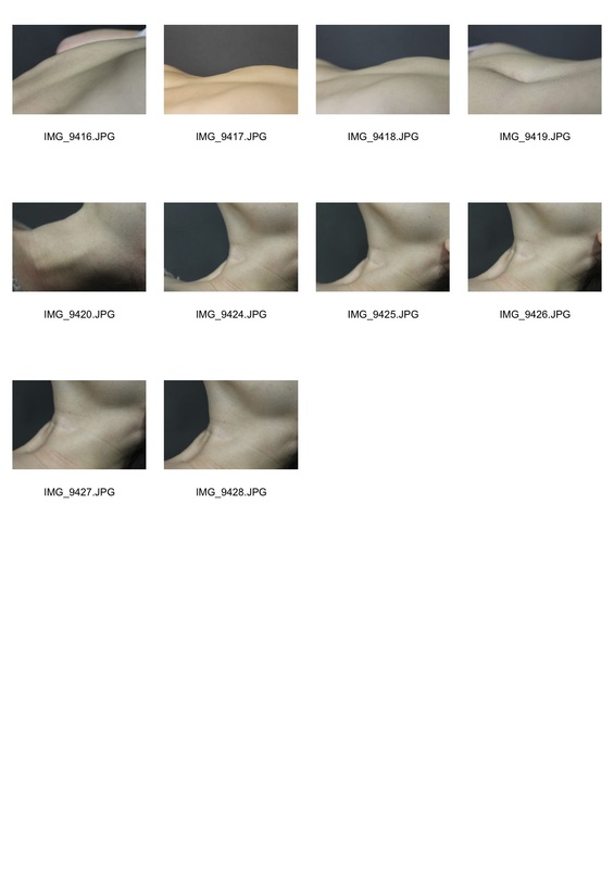
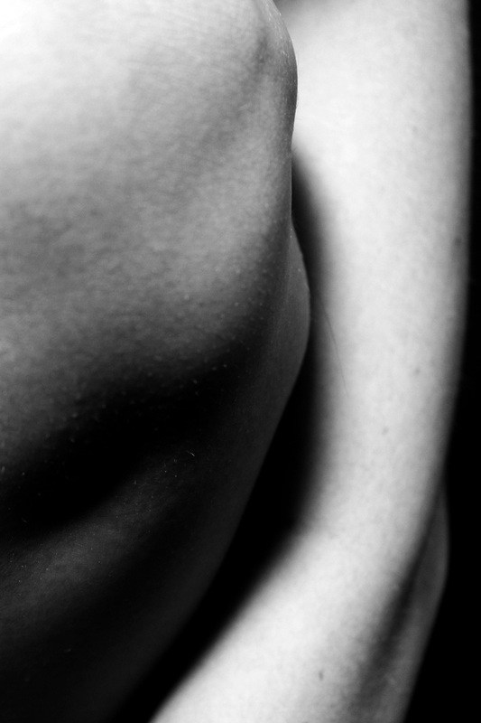
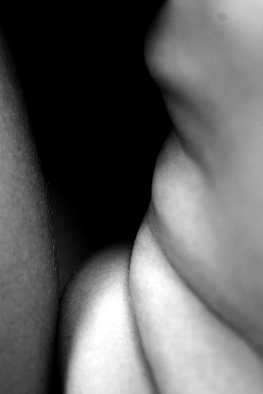
FORM: The human figure captured in ways that distort it to the eye. Focus attention on how the body moves; creases in the flesh, symmetry in bones, how the body bends etc. Simplistic images that are primarily zoomed in or captured close up in order to capture the body in ways that wouldn't be noticeable to the eye, therefore distorting its form even more, creating curiosity as to what image is what part of the body.
PROCESS: Studio setting, using a nude model. I would place my model into positions primarily based on sitting on her knees, crouching over, stretching the body and tensing her muscles. Generally quite simple direction, had to focus more on my angling and positioning in order to capture the distortion effectively. In the editing process, for each image I converted the mode to grayscale and enhanced the contrast to achieve interesting textures within the skin and more tonal variety. This also came through when adjusting the levels within each image. Generally tried to keep to a similar editing process in each image in order to have a coherent outcome that reflected my original work and my inspiration from Brandt and Weston.
CONTEXT: Outcome was inspired a lot from the progression of my idea "Ugly Beauty" that became more about beauty in its ugly form. My aims were to attempt to capture this idea along with inspiration from Brandt and Weston's nude series. From an audience perspective, I ultimately wanted to create interest from the curiosity as to what each image actually was - which body part/s they represent. I envisioned quite a simplistic outcome with more attention to detail on the natural distortion of the human figure and the variety within each shot.
EVALUATION: After this outcome, I feel that the use of the word 'ugly' doesn't quite fit as there isn't much physically ugly about the images more their distortion being something that looks unreal or absurd. Having this particular response to my outcome, was successful for me as I felt because of this I was achieving something more original and absurd within the distortion of the images. Overall, I really liked this outcome and felt it corresponded well with the progression of my over riding theme of beauty in its 'ugly' form. Compared to my raw images, the editing I feel really enhances the distortion as it brings out a variety of tones and textures within the skin that aren't visible both to the eye or in their original colouring. Finally, I also think that this series is effective in being a coherent piece of work that would look compelling if presented.
DEVELOPMENT
For further experimentation, I want to come up with other ways in which I could distort the figure. I am interested in experimenting with using a different model, someone older than my original model so to get a more natural textual and tonal variety within the skin and therefore more distortion in the image. I also want to the think of unnatural ways of achieving that whether that means incorporating a physical element, such as the steam and water I explored originally, at the beginning of my experiment.
|
|
JOHN COPLANSJohn Coplans was a British artist - a veteran of World War II and a photographer. In 1984, Coplans began taking the photographs of his own body with which he established his international reputation as an artist. This series are a candid and sometimes humorous exploration of his own body. They were originally 4x5 inch Polaroid photographs, enlarged to large-sacle black and white photographs, often presented in groups. By cropping off the head, Coplans presents these depersonalised images of the body as a surprising, intriguing object, fascinating in detail and flaccidity. His work also stands as a retort to the cult of youth and beauty represented by commercial photography and what Coplan's saw as the vanities of the 1980s art world.
I took inspiration from the compositions of Coplan's photographs as I liked the symmetry of the images. The images are simplistic and represent distortion of the human figure, specifically the flesh and fat of the natural body. Furthermore, the natural texture of Coplan's skin works well in these images as they distort not only the figure but also people's perception of how the flesh and skin develops with age. |


ARNO MINKKINENArno Minkkinen is a Finish photographer who works in the United States. His work explores an uncanny juxtaposition between the human body and landscapes, where body parts function as the integral parts of trees, rivers, skylines and rock formation. Many of his photos require extreme physical risk, dangling his body from cliffs, holding his breath underwater or at times facing his greatest psychological fears.
I was inspired by how Minkkinen combines the figure with the natural outside landscape. At times the distorting of the figure in some of his images is aided by the landscape due to the way he positioned himself and the symmetry between the two aspects. Also the textual and tonal contrast between the skin and the landscape works well here and enhances the distortion of the figure and the flesh. |
|


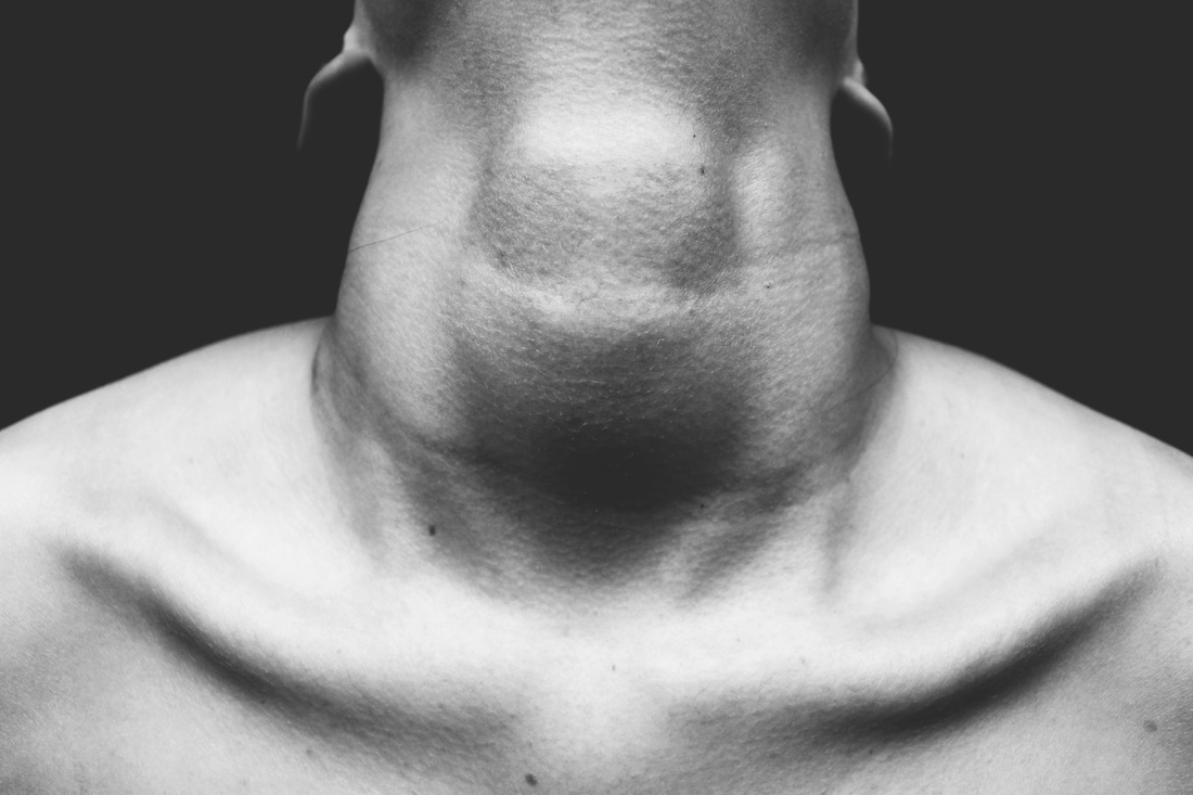
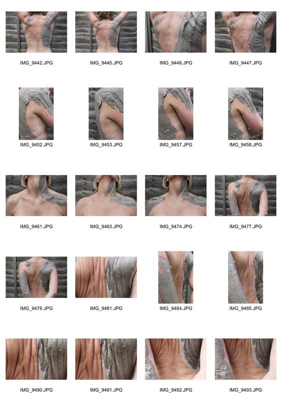
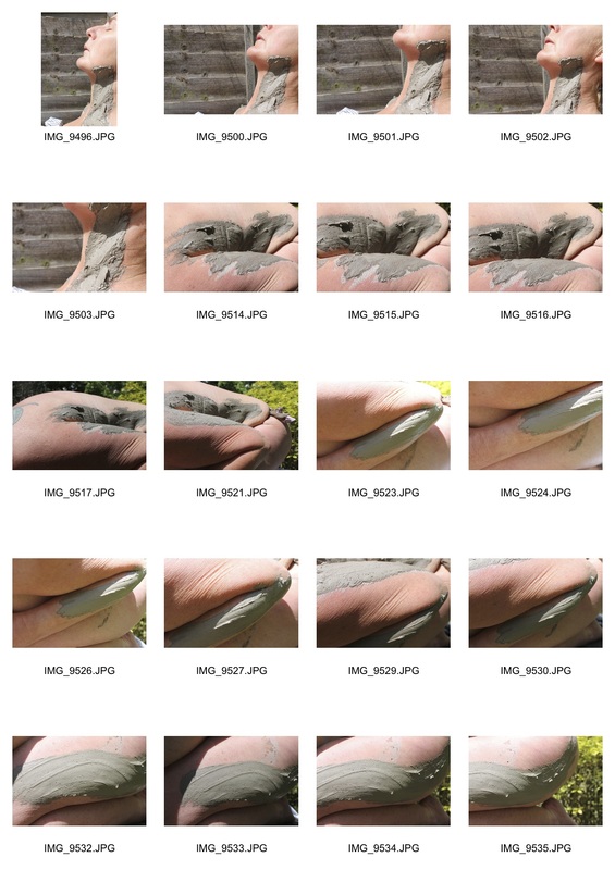
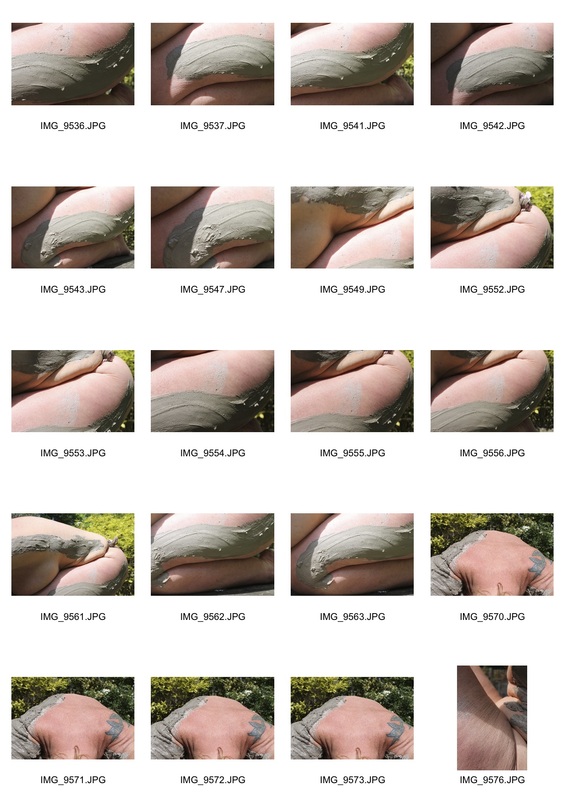
Taking inspiration from both Minkkinen and Coplans, I decided to experiment using both an older model and taking the images outside the studio to an outdoor space. Similiarly to the contrasts in textures in Minkkinen's images, I took my model against a rough, withered fence. Furthermore, I was also interested after my previous outcome to add another element to enhance the distortion, therefore I decided to add clay on to my model's body in order to enhance textural variety and experiment with how the thick and lumpiness of the clay can take my intentions of distorting the human figure to new heights. Also thinking back to the exam theme, it relates to bringing the outside in. Taking a natural element and imposing it upon the figure.
RAW IMAGES
|
|
|
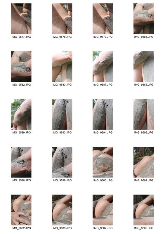
|
|
EDITED OUTCOME


|

|

|

|

|
FORM: The human body captured from varying angles and levels that distorts its figure combined with the textual contrast between the skin, the thick, lumpy clay and outside scenery. Again, channeling the natural creases and flesh of the figure in order to capture something original and absurd to an audience.
PROCESS: Taken in front of an old withered fence outdoors in sunlights. Positioned my model into positions primarily leaning over, crouch down and tensing the muscles. Similar editing process to the same; transforming to grayscale and altering the contrast and levels of the image in order to obtain more textual and tonal contrast, especially between the skin and the clay. CONTEXT: My aims were to continue to distort the natural figure, focusing on my idea of capturing beauty in its 'ugly' form. I wanted to show harsh contrast between the clay and the natural skin and aim to see whether or not that could enhance the distortion within the image. |
EVALUATE: At first, I was unsure going into this shoot what my outcome would be. Therefore, I stuck to the similar composition and outcome of my previous work and was experimental with the clay. Overall, I am really impressed by how the images have turned out and I really like how the clay looks on the figures body. Using an older model definitely worked to my advantage here as the contrast was made greater between the withered skin and the thick, crusty clay. However, being outside for this particular shoot was difficult as I had to deal with shadows and bright sunlight which was difficult at the moments I wanted to get close up to the body. I also found this hard when editing the images as the contrast couldn't be made to great because of the already contrasting bright light and shadows. On the other hand, I was definitely inspired by this experimentation and felt it was a good form of refinement towards my final piece.
CLAY CROPPED EDITS


I think the cropped versions of these photos work better as they create more distortion and detach the body parts better. Because I was outside and the lighting was less in my control, I had to compromise and capture some of the images at more of a distance compared to my previous outcome. Therefore by cropping them, channels the idea I got across more in my previous outcome and achieves my overall aims.
FINAL OUTCOME - PRESENTATION IDEAS
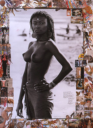
PETER BEARD
Peter Beard is a photographer, artist, diarist and writer. Beard channels most of his creative energy into his collage-work and diaries. Beard was inspired by Karen Blixen's 'Out of Africa', which enthused him to travel around Africa in 1955. He took many pictures of the wildlife there and began putting them into collages and using animal blood and remains along with clippings to create his work. Beards work is very different to mine but after seeing his collages, I was inspired in how I could use the clay on the actual image to both distort it and create an interesting presentational idea.


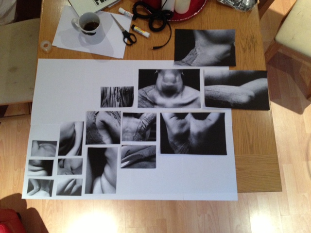
PRESENTATION RESPONSE:


FORM: Laying clay onto the actual photographic image, following the motion of the flesh and bones within the image.
PROCESS: I printed out the photo and watered down the clay in order for it to easily blend on the photo. I then waited for it to dry in order to see the crusty, hard texture that the clay would create on the image.
CONTEXT: My aims were to see if this could be an effective way of enhancing distortion and also creating an original, interesting presentational idea. Wanted to see if I could achieve both distortion of the figure but also because it would be painted on to the photographic image, distort the actual picture also.
EVALUATE: After experimenting with many of the different photos, I came to the conclusion that this idea did not work. First of all, the way in which clay moves on the image was difficult and became hard to put on, creating a messy image. Furthermore, once the clay had dried, it cracked and crumbled off the image leaving a pointless, dis-coloured marks on the image. Interesting to do as I liked the look of the clay on my original images but not the intended effect I had imagined.
REFINEMENT - MERGING CLAY AND FLESH ON PHOTOSHOP
Following my less successful experimentation with Beard's collaging technique, I decided to attempt to take the idea but complete it through photoshop. I wanted to take some of the good, close-up shots of the clay on my previous outcome and merge it onto the other photos I produced.


FORM: The human figure captured in ways that distort the body to the human eye. This time combined with images of clay that seem to crawl onto the skin as if infesting it.
PROCESS:
1) Opened both images into photoshop in separate windows.
2) I dragged the image of the clay onto the background image to create a layer. Positioned the photo to match the flesh behind, where it would suit best.
3) I then merged the two images by altering the opacity of the layered image of the clay onto the background image.
4) In order to make the image of the clay fit into the outline of the figure, I rotated it and warped the image to follow the outline of the body.
5) I then used the polygonal lasso tool in order to fill any unwanted, excess parts of the layered image with the original colour of the background image.
6) I then merged both layers together.
7) Then, I used the healing brush tool in order to blend the two images together. I cloned the texture and colour of the original skin and used that to merge the textures together. I also used the sharpen and smudge tool to blend the images together. I tried following the pattern of skin elsewhere in the image and did long smooth brush stokes in order for it look as one and fluid.
CONTEXT: My aims were to combine the two elements of distortion that I had experimented with previously. I wanted to take the better outcome of the distorted body images but combine it with the distortion that the clay creates when on the body. My intentions of completing this experiment through Photoshop was that I could have the clay to look as if it was growing on her skin, subtly but also effective in distorting the figure even more.
EVALUATION: I was very pleased with the outcome of this experiment. Although I faced difficulty with merging the two images together because they were shot in different circumstances and had different tonal variety, I still managed to layer them effectively enough to look realistic that it was one image and be fluid. I believe my intentions for this outcome were achieved in two ways. Firstly, being that the clay does look like it is crawling on her skin, growing up her body and almost infesting the skin both subtly and effectively and secondly, because each image as a whole is completely distorted against what it originally was. Not only do the body parts look at times unrecognizable and absurd the clay that's growing up her body enhances the distorting by manipulating the skin and flesh that I originally was interested in achieving through my other experiments. Overall, I think that I have achieved my intentions and aims of this experiment fully through this outcome and will strongly stand out as my final piece for this exam project.
EVALUATION: I was very pleased with the outcome of this experiment. Although I faced difficulty with merging the two images together because they were shot in different circumstances and had different tonal variety, I still managed to layer them effectively enough to look realistic that it was one image and be fluid. I believe my intentions for this outcome were achieved in two ways. Firstly, being that the clay does look like it is crawling on her skin, growing up her body and almost infesting the skin both subtly and effectively and secondly, because each image as a whole is completely distorted against what it originally was. Not only do the body parts look at times unrecognizable and absurd the clay that's growing up her body enhances the distorting by manipulating the skin and flesh that I originally was interested in achieving through my other experiments. Overall, I think that I have achieved my intentions and aims of this experiment fully through this outcome and will strongly stand out as my final piece for this exam project.
FINAL PRESENTATION IDEAS:
My main photographs that I want to display are the distorted clay body shots that I completed in Photoshop but I also wanted to combine these with some of my original shots that still have great potential in representing the distorted figure - beauty in its 'ugly' form. Therefore, I selected several other shots from those previous outcomes. When presenting them, I have decided to print each image in different sizes ranging from A3 to A5 depending on which I believe stand out and are most effective. I am them going to mount each image onto black foam board and stick them onto black card. I wanted the display to look coherent and for all the images to work well as a series. Because I chose images from three different outcomes I have depicted three different ideas of how I should present them:
|
1) Diagonal:
Have the images growing from big to small diagonally up the card - the big ones being the digitally manipulated clay and body images. I felt this idea works well because it's visually interesting but also shows the progression of the final piece. Because the smaller images are my original body distortion shots, having them smaller and at the bottom makes it look like they have progressively grown into the larger images which are technically my final piece. Inventive idea and also clear way of showing the refinement in this project. |
|
|
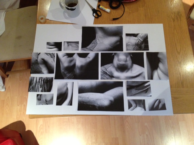
2) Re-construction
For this presentation idea, I attempted to re-construct the body subtly just by having the relevant parts of the body mounted as if trying to recreate the natural body. For example, as you can see the middle of the body e.g. the back and the torso are placed centre whist the neck and shoulders are above that and the legs and feet placed below. Although quite simple and subtle, the idea is nice as after distorting the body and the body parts the idea of reassembling it highlights what body part each image represents. |
|
|
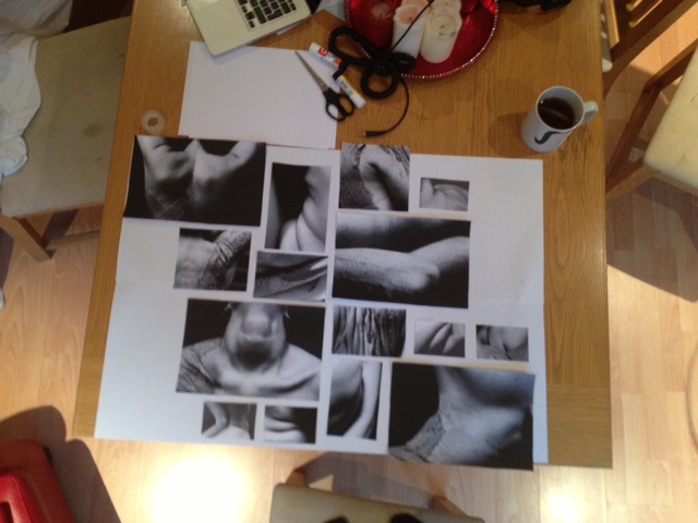
3) Random
Lastly, I experimented with a completely random presentation of the images, with no coherence just what looks best size and image wise next to each other and presented on the card. I like this idea as it shows the variety within my outcome however I do want to make the images look like one coherent piece. |
|
