Summer 2012
Saatchi Gallery Visit
DAVID BENJAMIN SHERRYDavid Benjamin Sherry is an American artist based in New York City. Sherry works primarily with photography, exploring colour through a mixture of landscape and studio work. Sherry often works with analogue film and original printing techniques. The colours in the images are cast at exposure or later during printing and the kind of cast depends on his mood. I like this concept as it makes the images more personal and adds an alternative aspect to landscape photography. Sherry's dramatic mountain landscapes you would wonder if his key influences were great American photographers such as, Ansel Adams or Minor White. However, Sherry takes most inspiration from painters or installation artists who work with colour and light. Among them are Robert Irwin, John McCraken and Ann Truitt. When I visited this exhibition, the images were extremely striking and stood out when mounted. I love Sherry's ideas around the use of colour which I think adds an interesting and inspiring dynamic to landscape photography.
|
    From left: Hypeborealis, All Matterings Of Mind Equal One Violet, Holy Holy, Soaring Yellow Morning Breath
|
Response - edited with photoshop
|
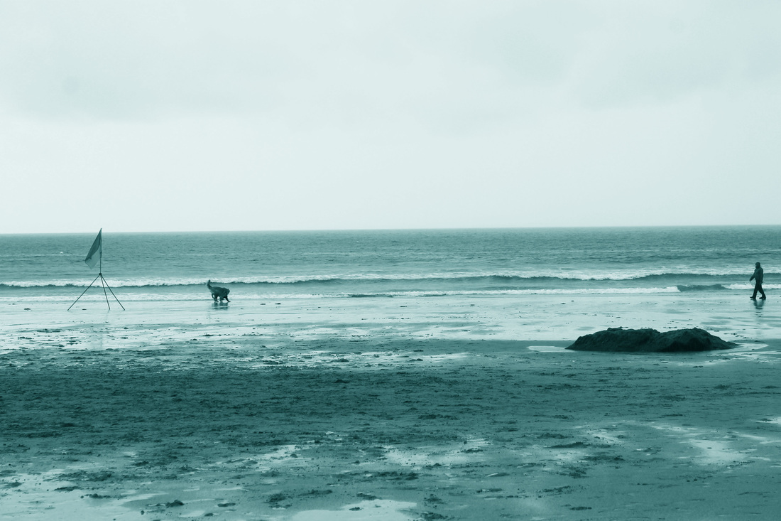
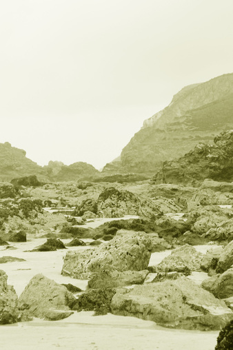
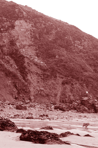
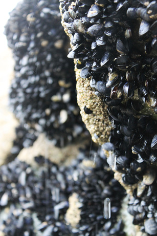
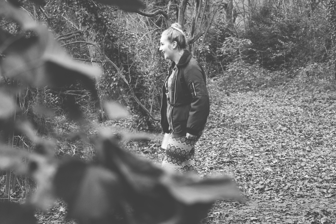
Taken at the coast in Cornwall. Tinted the photo using photoshop according to the atmosphere I got from the image. Left (of the sea) I feel a blue/purple colouring corresponded to the tranquil, pure, calm atmosphere I got from the image. Bottom left (crumbled rocks) I incorporated a yellow tinge to the photo because for me this colour reminds me of vast, open spaces which was like this cliff face when the tide was far out. Bottom right (cliff face) has a red tinge which suggests danger which was relevant here because of falling rocks.
|
|
|
|
FORM: Dramatic landscape photographs taken at the coast in Cornwall. Images are tinted according to the mood or atmosphere that I felt when standing within this landscape.
PROCESS: Taken digitally and edited through Photoshop by tinting the images with the colour enhancing tool.
CONTEXT: Primarily, I wanted to capture the same sense of drama in Sherry's work. I wanted the landscapes to look almost overwhelming and therefore be more striking to the eye. I aimed to do this by experimenting with my angles by placing myself at different levels, also playing with what works better as a landscape or portraiture shot. I also hoped that by instilling the atmosphere I felt when being apart of the landscapes through colour would add an interesting dynamic to landscape photography, akin to the work of Sherry.
EVALUATION: I believe this work is a good response to Sherry. The colours bring relevance to each landscape and I like the textures that are brought out from the rocks and sand which enhances the drama of the landscape. I like the outcome of adding a figure to the image - puts into context the greatness of the landscape, especially in the last image. The dog in the foreground most definitely helps put into context the sheer height of the cliff face from the comparison between the two. One critic would be I think it would be more interesting to experiment using the dark room facilities in order to tint the photos as the colours might be more striking and the overall image look more dramatic.
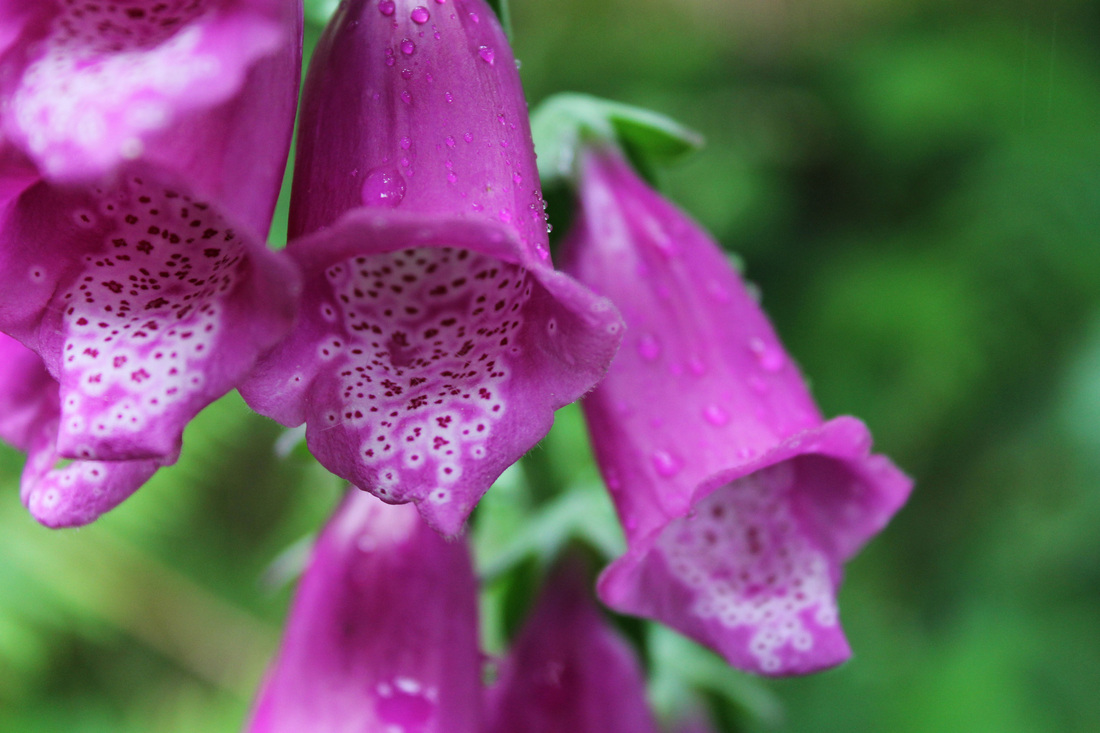
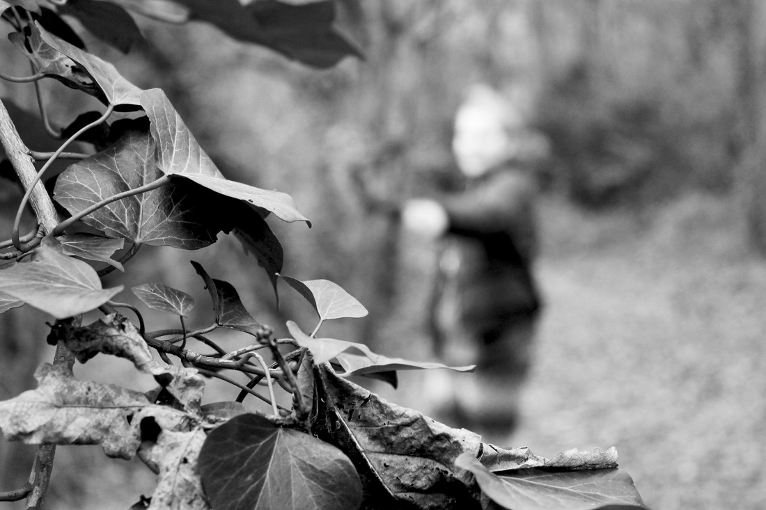
2nd response from Cornwall - nature close-up using depth of field.
|
|
'Tales of London'
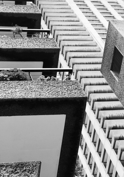
Barbican Visit
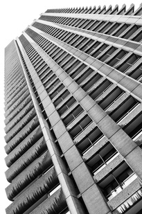
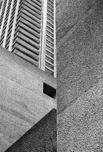
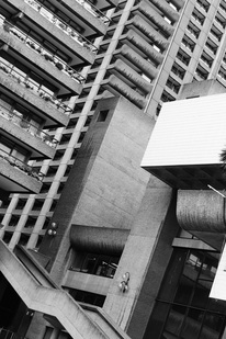
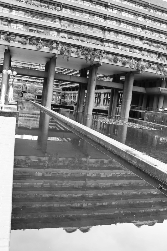
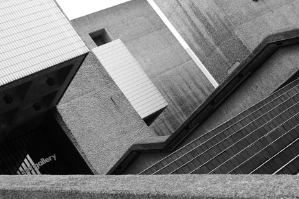
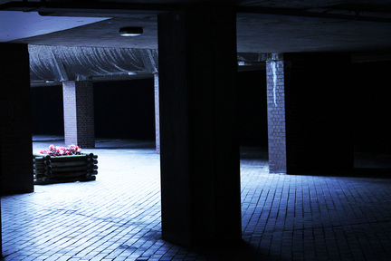
Set task to document a structural, industrial response to a vision of London. I experimented with angles, shapes, reflections, textures, light and size. I wanted to achieve a harsh, dirty outcome from this set and create at times a distorted and confusing reaction at how the buildings and levels overlap on one another and create different, contrasting angles.
|
|
|
Black and white colouring enhanced the dirty, gritty atmosphere achieved from the photos. Increasing the exposure and contrast also helped to bring out the harsh textures of the buildings.
|
|
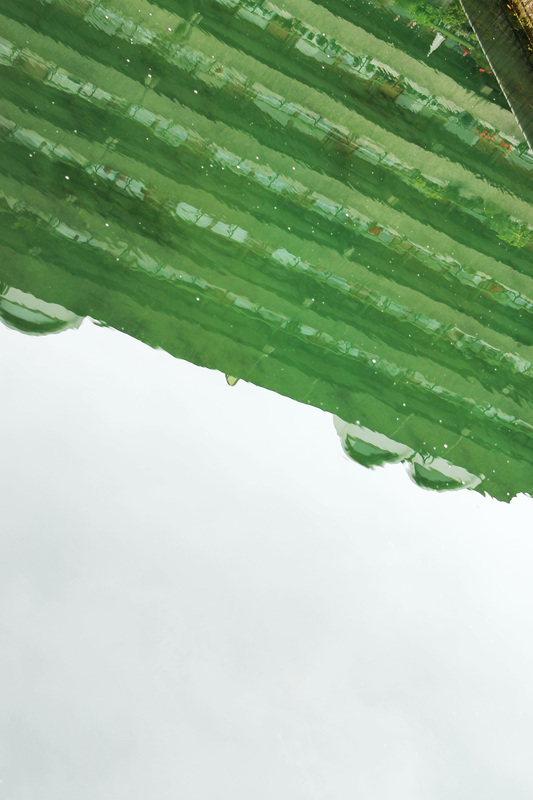
Reflections worked well in showing the structure of the buildings; they had incredible symmetry and design that could only be appreciated as beauty when captured on photograph. The photo to the left I left in colour because I liked the colour of the building when reflected into the water.
|
|
September 2012
My brief is to create a body of work that captures a subject's identity in a variety of ways.
IDENTITY: Youth
|
|
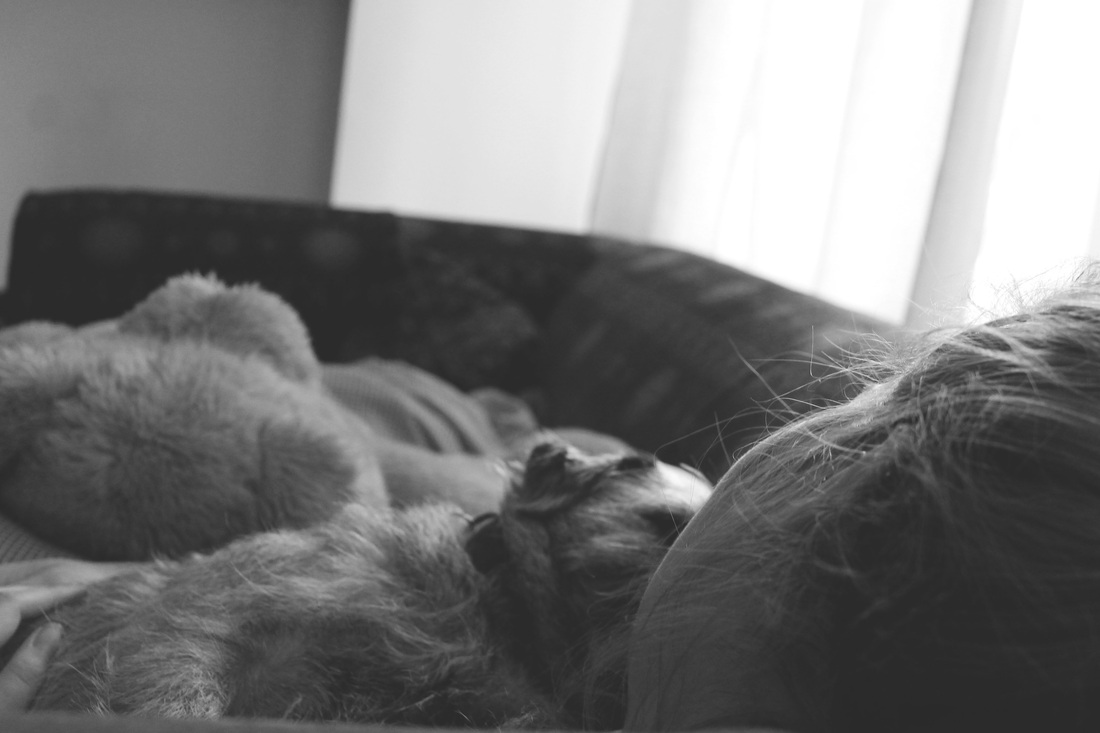
Inspiration for these black and white photographs that capture the spirit of youth come from the American photographer Sally Mann. My admoration for her series At Twelve (1988) and Family Pictures was the starting point for the concept of my own work. At Twelve: Portraits of Young Women “captured the confusing emotions and developing identities of adolescent girls and the expressive printing style lent a dramatic and brooding mood to all of
her images" - Museum of Contemporary Photography, Chicago IL. Many of the pictures were taken of her own children at their family's remote summer cabin along a river. |
Mann's photography explores typical childhood themes - skinny dipping, dressing up, napping, playing board games - whilst at the same time touching on such darker issues - insecurity, loneliness, sexuality, that represent Mann's photography as something much more raw and genuine than other typical "family portraits". http://sallymann.com/
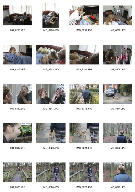
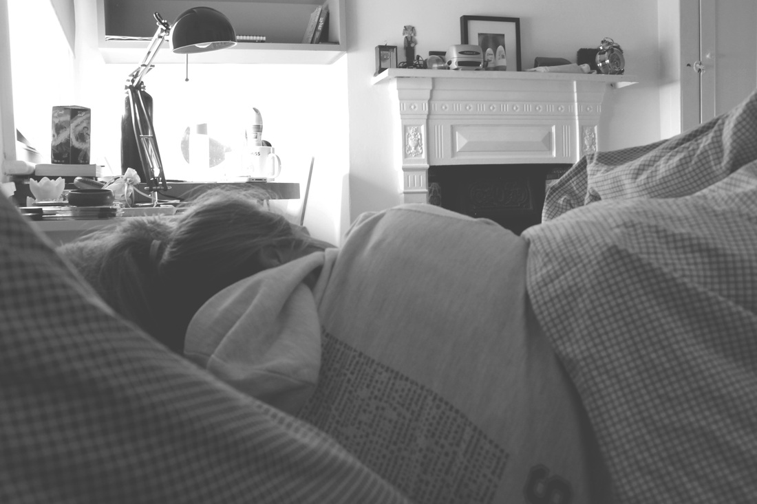
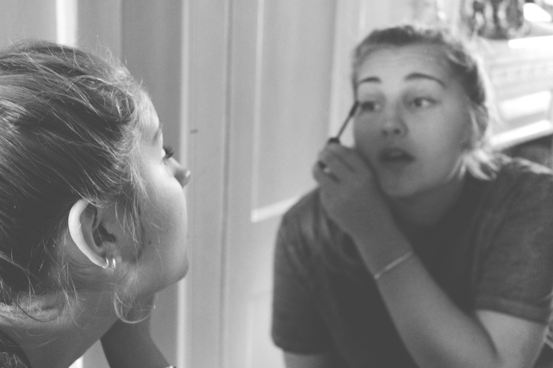
As a response to Sally Mann, I went to visit my cousins in Brighton and attempt to capture their essence of youth. More specifically I wanted to also explore the difference between a young boy and a young girls identity - this to me was important as the essence of my cousins identities are so different - the boys loving surfing and adventures that aren't so suitable for 6-8 year olds and their little sister who enjoys anything pink, specifically flowers and 'swishy' dresses. I wanted to capture the spirit of being young and the idea that the expanse of the world in which they live in is much greater to them yet their presence is one that is so full of life - which comprised with their naivity makes any adventure possible. I took these with a Pentax k1000 film camera in order to attain a grainy, more authentic feel, akin to the look of Sally Mann's images - black and white imagery you could say also mirrors how being still so young means a child's progression in life is minimal which is similar to the photography in the past before coloured imagery was discovered.


Last of my images is blurred due to technical, human error when using a film camera. Although the object isn't defined, I actually think because it is so recognisable for one of the things a young girl could be playing with (a doll's house), that it even strengthens the concept that I explored in my curatorship task through non-figurative identities - the connection we make so effortlessly from how certain interests and hobbies can instinctively identify a person's identity without ever even encountering them.


A lot of the images in Sally Mann's work and in my response showed the figure by themselves. In my response, my intentions were to show the essence of youth that I believe is enhanced by the comparison with the vast expanse environment in which I captured them in. Therefore, to develop this idea I wanted to experiment with this idea of 'A lone figure' and what atmosphere it created alongside how if at all the identity of the subject is portrayed.
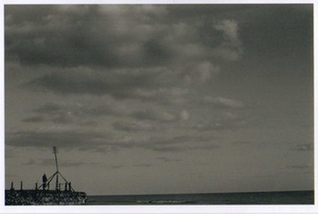
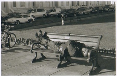
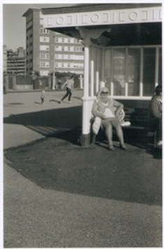
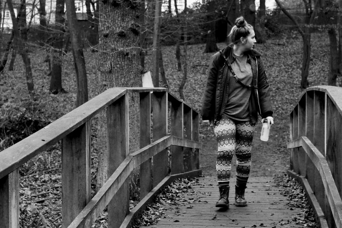
IDENTITY: A lone figure
Further documentation from Brighton beach. A sunny, Autumn day, strangers seemed increadibly serene, thoroughly enjoying the warm weather. The world can seem very vacant and vast when you are fulfilled with a moment of calm. A subject's personality is hard to identify through these photographs but the atmosphere that is extracted from them can easily correspond to the emotion of how a person is feeling at that moment. Determining on what atmosphere different people will obtain from the images, it brings you closer to discovering the subject's identity.
Development Ideas...
The lone figure shots were purely just experiments, documenting the general atmosphere at the seaside however, I wanted to develop this specific idea further because I think it has some great potential. The main concept that I wanted to take forward was how although they may not be an obvious interpretation of a subjects identity, what I do like about them is how by singling a figure out makes them stand out more as one of a kind which reiterates a comment I made in my dissertation about how I was fascinated by how every single individual is "physically and biologically different". I think that the lone figure idea highlights this comment as when capturing the figure within the expanse of any landscape or environment makes them seem more apparent to be one part of a very huge world, similar to my concept behind capturing youth previously.
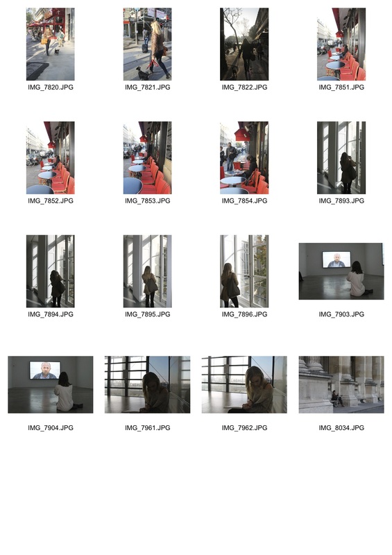
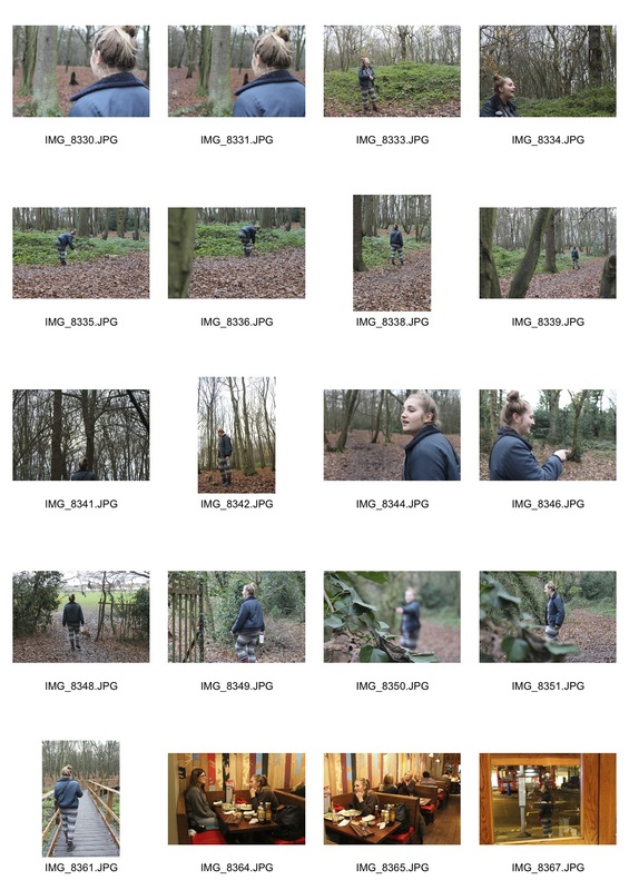
'A lone figure' Development - Paris
On a trip to Paris, I specifically attempted to further my idea of the lone figure but documenting people and friends when exploring the city. The landscape of Paris, I felt would be good for this development as it's architecture and general atmosphere would highlight this concept well.
Raw Images
|
Edited Outcome


The images are very varied as an outcome together physically as the share some similar but mostly different looks, colour and proportion wise but also with the settings being so different, due to the variety of places I visited in Paris. However all of the images maintain this idea of an isolated figure or 'a lone figure' that I wanted to develop. There is a documentary style to the black and white images that brings out the same vacant atmosphere of the images at Brighton beach. The other images in colour I thought were interesting because of the proportions and angles within them. The bright lighting and shadows created darker, silhouetted figures that made the 'lone figure' feel more distant and mysterious to an audience. What I believe would make these images even better was if there was a stronger correlation between the images in the way they look and first appear to an observer.
Development - Hampstead Heath
|
|
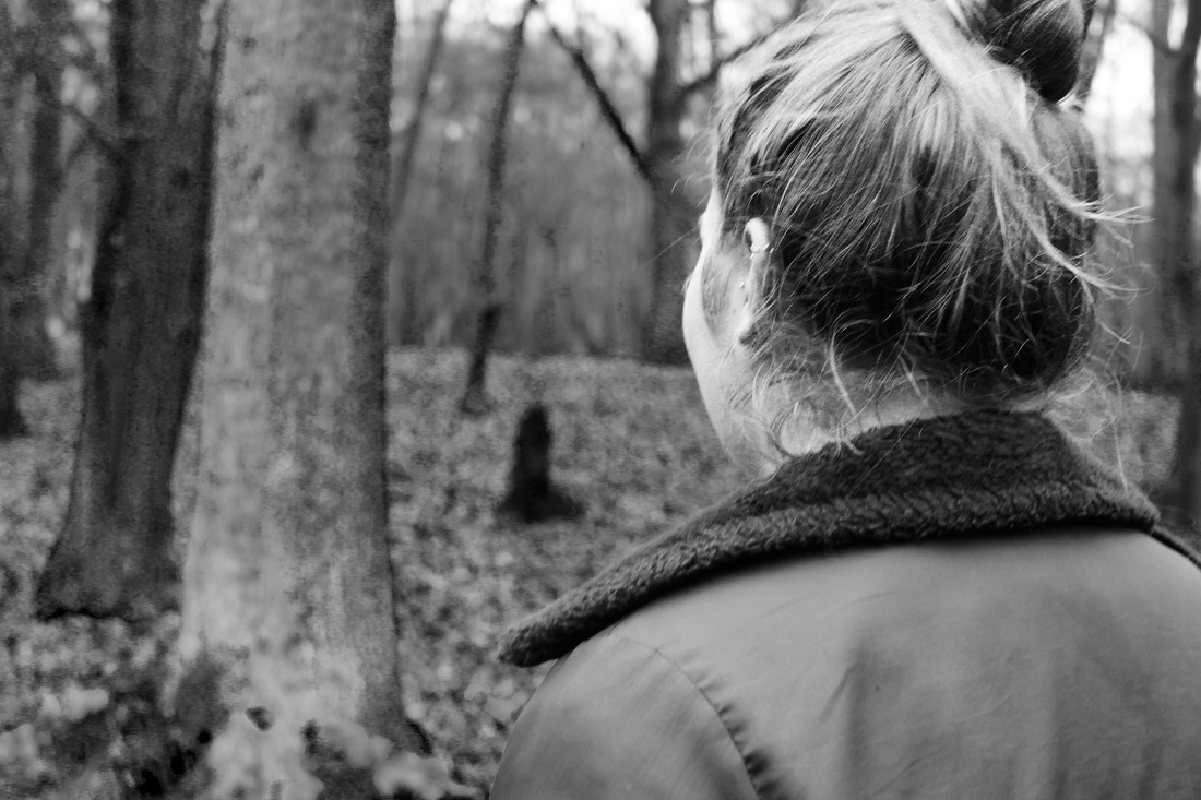
DEBORAH TURBEVILLEIn my development for "A lone figure', I was inspired by Deborah Turbeville's photograhy. Within her primarily fashion photography work, Turbeville's lone figures are placed in dramatic landscapes and environments that give her photos an authentic look of age which inspired me to take a lone figure to somewhere similar. The 'lone figure' being placed in a more vast, open landscape makes them seem even more alone and emphasises this idea of human existence being so minute compared to that environment which I explored in my 'essence of youth' outcome. I was also inspired by the woodland-type environment that Turbeville places her figures in as it creates a more interesting image, specifically with the intricate detail of the trees and branches highlighted so predominantly.
|
|
Raw Images
|
Edited Outcome
The black and white imagery works well here as it enhances the rustic feel that you get from the branches and leaves on the ground. The intricacy of the branches of the trees I enhanced by increasing the contrast within the image which creates a more interesting image. Being black and white, I also like how the figures almost merge into the background. Even though the surroundings themselves are very mush busy and detailed the lone and isolated figure here still creates this vacant look that I have been trying to achieve through my development. What I mean is that to an observer the lone figure is to be seen as small and minute to the scale of the environment in which they are placed in.
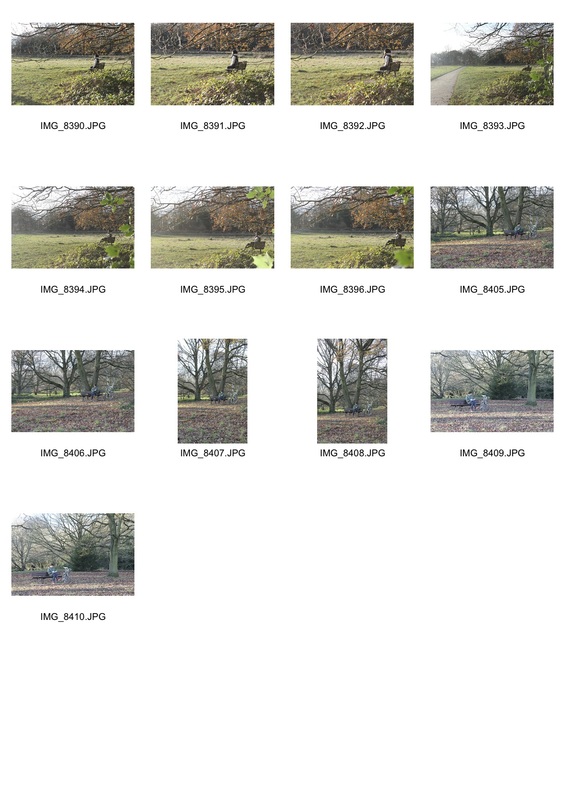
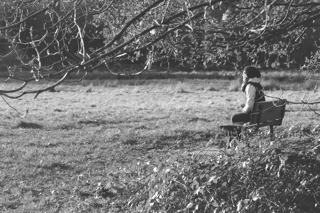
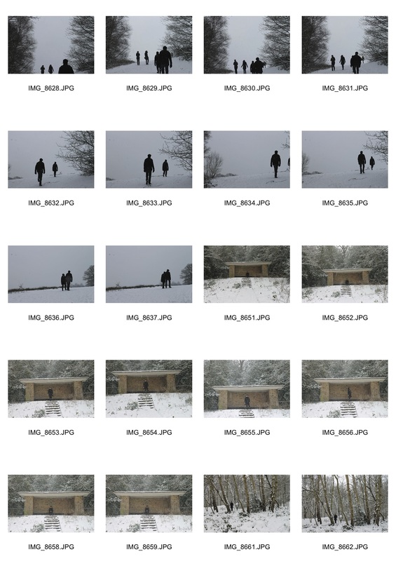
Winter Development - Hampsted Heath
I took this idea further and went back to Hampsted Heath in order to try and capture that same effect. In my previous outcome, I liked how the scale of the environment compared to the isolated figure made them seem minuscule and made their identity seem minute however still an integral part to the beauty of the shot. Therefore, I developed this by capturing the figure against even greater heights ...
|
|
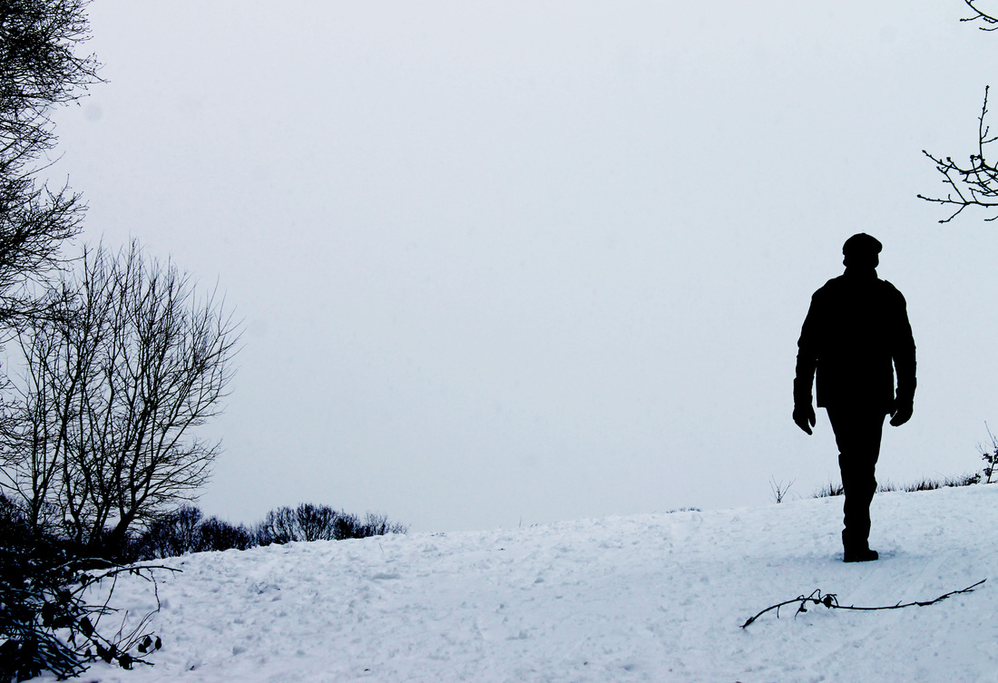
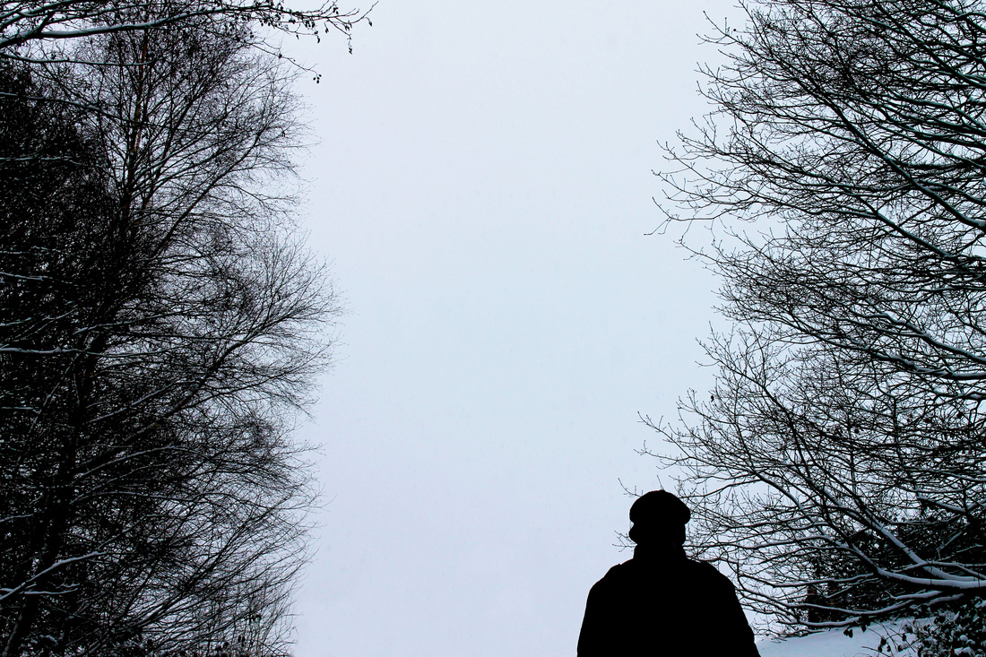
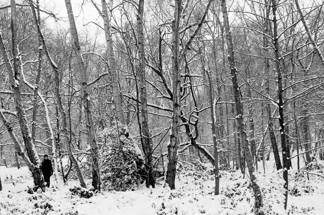
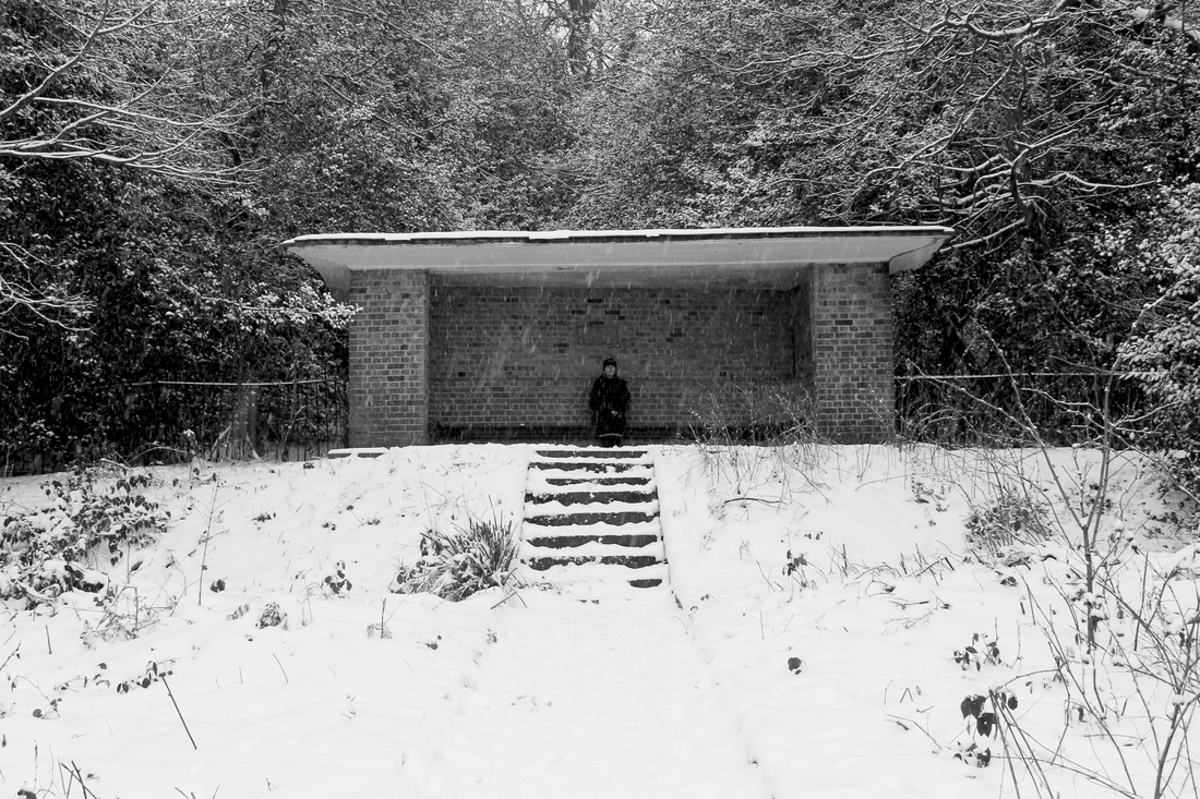
FORM: An isolated figure captured in the landscape of a snowy woods.
PROCESS: I went to Hampstead Heath and focused on capturing my model isolated within the woodland. I also wanted to experiment with silhouettes , concentrating on the positioning of the figure so that they subtly stand out yet fit into the environment. The last two images I edited into black and white as I thought the snow on the trees looked better in this way. In all images I altered the contrast in order to make the texture of the branches stand out and generally sharpened the edges making the landscape and the figure stand out.
CONTEXT: This outcome was a development on from my last experimentation in Hampstead Heath, however I thought the snowy landscape would make the model, wearing black, stand out more and be more prominent. I was interested in how I could contrast the figure to the landscape through the composition of the image and where I positioned the figure amongst the dramatic landscape. This specific thought was inspired by my previous experimentation into David Benjamin Sherry's work I did in the summer.
EVALUATION: I liked experimenting how the figure looked in this specific landscape - I think it creates a more alternative perspective of the isolated figure than the last outcome in Hampstead Heath. There's something mysterious about these photos that I think is created from how the figure feels so distant from the lens. I like the look of this idea however, I don't want to steer too far away from my original theme; identity. The images by themselves I think are striking and interesting however the correlation to my theme isn't strong enough.
Development - 'Day-in-the-life'
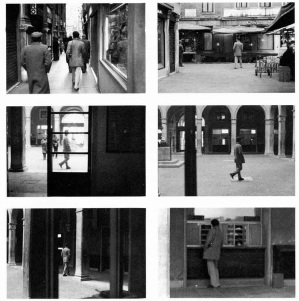
I liked the environment of the woods from my previous outcome, but felt I needed to develop more substance within the photos. I wanted to try combining the landscape but with a new idea. With inspiration from Sophie Calle's 'Suite Venitienne', I decided to experiment with capturing a figure in their daily life. A snapshot almost into their life and what surrounds them i.e. their habitat, family, clothes, interests etc. that can be seen as the make-up to someone's identity. To do this, I would have to be a part of someone's daily life and capture them in a documentary-style way. Like taking on the role of their stalker for the day.
SOPHIE CALLESophie Calle is a French writer, photographer, installation artist and conceptual artist. Her work frequently depicts human vulnerability and examines intimacy and identity. Her series, 'Suite Venitienne' is a result of meeting a man at a party in Paris whom she followed to Venice in disguise and stalked him around the city, photographing him. Calle's observations of the man she identifies as Henri B, includes black and white photographs presented in as a book accompanied by text. I took inspiration from Calle's methodology in order to capture my next experimentation and took on her stalker/detective role with a friend of mine. Although my friend was aware I was taking pictures of her, I asked her to act completely normally and get on with daily chores as usual.
|
|
Raw Images
|
|
|
|
Edited Outcome
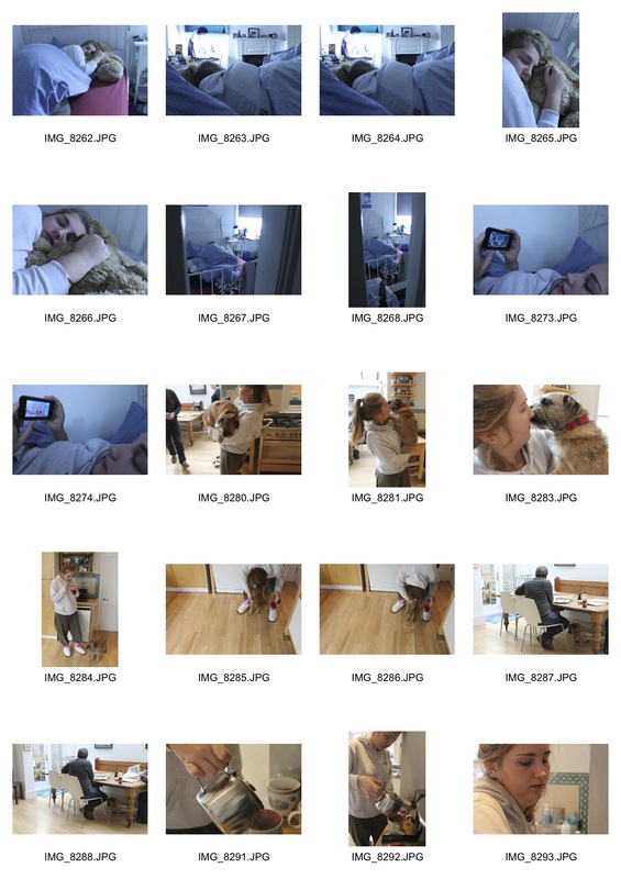
FORM: A snapshot into the day-to-day life of my friend, documenting her every move.
PROCESS: I followed a friend round for an entire day, documenting her daily chores and activities. As the photographer, I experimented with capturing the images from a perspective that looked as if the person was being followed. Edited into black and white.
CONTEXT: I wanted to create a series of images that captured the daily life of a person. I wanted to continue the isolated figure concept but achieve it in a way that was more representative of the figures identity - in this case be more relevant to their life, their identity. I wanted an observer to be interested into this person and have genuine curiosity as to who they were.
EVALUATION: As a whole series, I really like how these edits have come out. I think the black and white imagery works really well and the variety in composition and my angles with the camera keeps each image different and engaging. What I do feel didn't worked as well here is the mundaneness of each image. Because I choose to photograph a friend on a casual weekend the range of activities and daily life chores are pretty basic which looses some of the appeal and curiosity into looking into someone's life through a photograph. What could work is if I took that mundaneness to an extreme and captured the things every human does but doesn't notice doing because it's just their daily life. However seeing as I want to capture an essence of an identity, I think this idea would be too general and not concentrated enough on the theme.
What's next...
I feel to broaden the development of my investigation it would be interesting to take on a different direction on capturing identity. I think there are so many ways that I should attempt to capture identity in a new light. At times I thought in my outcomes for the lone figure the background was a little distracting and that I wanted the viewer to concentrate on the actual figure slightly more. Therefore I decided to experiment with some studio based ideas that capture identity/identities. The figure will still be isolated because I want to continue you that idea as I think it is strong however take it out of the landscape context I had experimented with.
I feel to broaden the development of my investigation it would be interesting to take on a different direction on capturing identity. I think there are so many ways that I should attempt to capture identity in a new light. At times I thought in my outcomes for the lone figure the background was a little distracting and that I wanted the viewer to concentrate on the actual figure slightly more. Therefore I decided to experiment with some studio based ideas that capture identity/identities. The figure will still be isolated because I want to continue you that idea as I think it is strong however take it out of the landscape context I had experimented with.
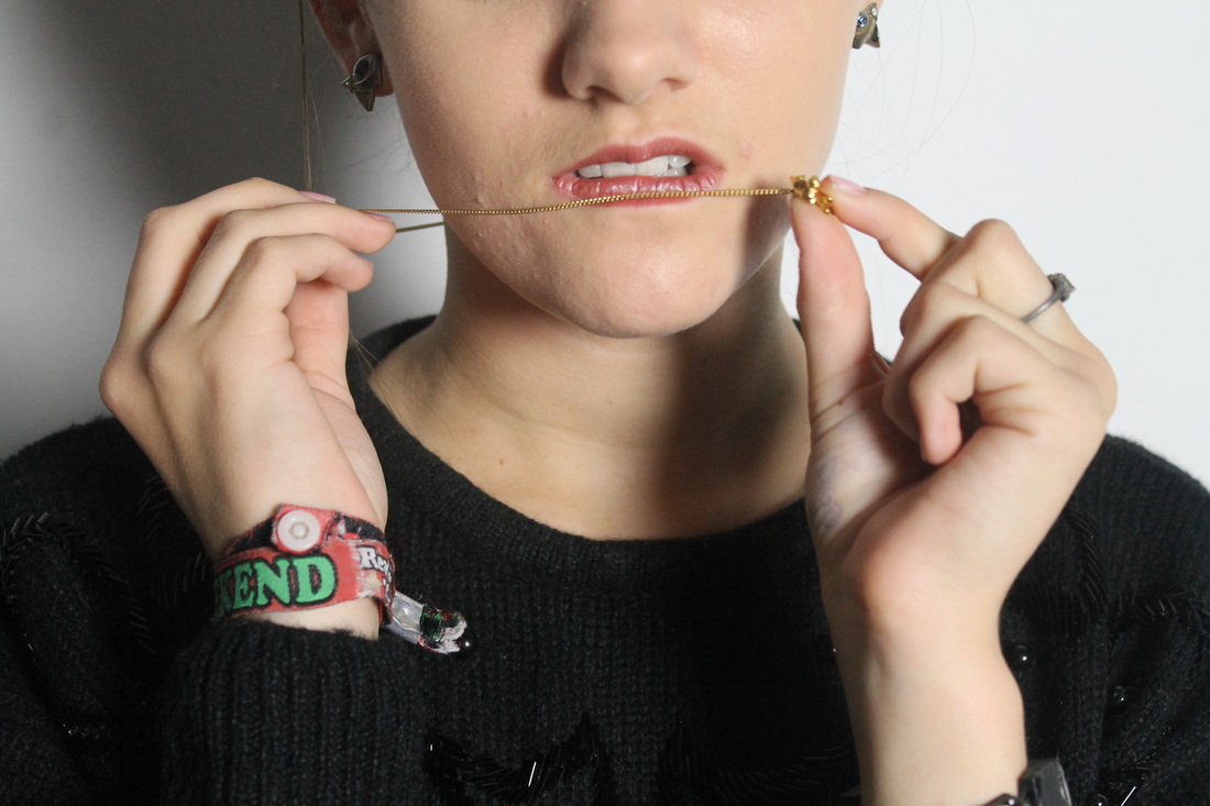
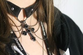
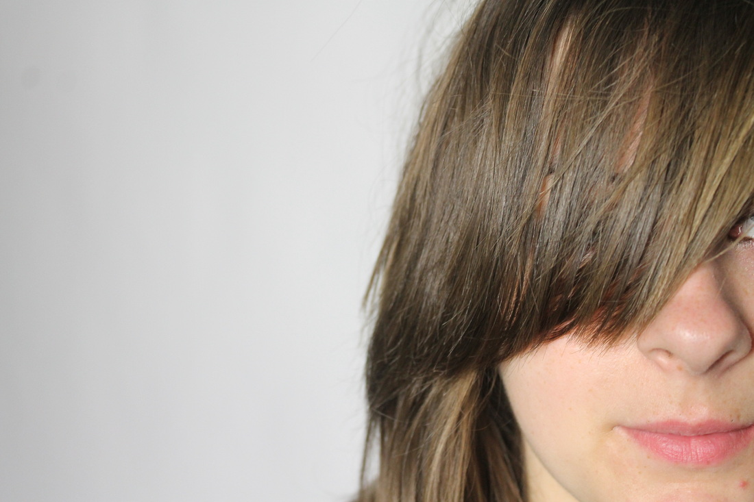
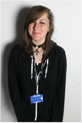
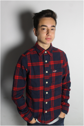
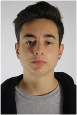
IDENTITY: Portraiture
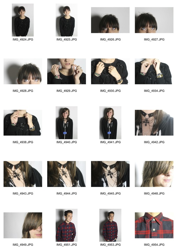
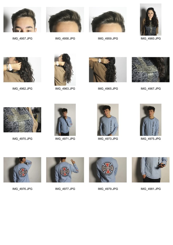
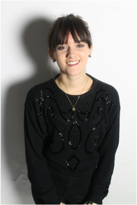
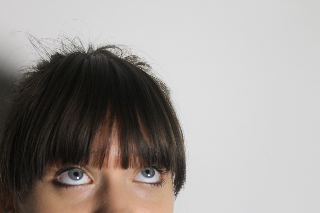
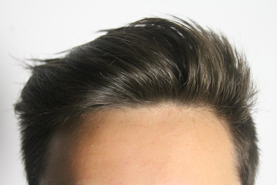
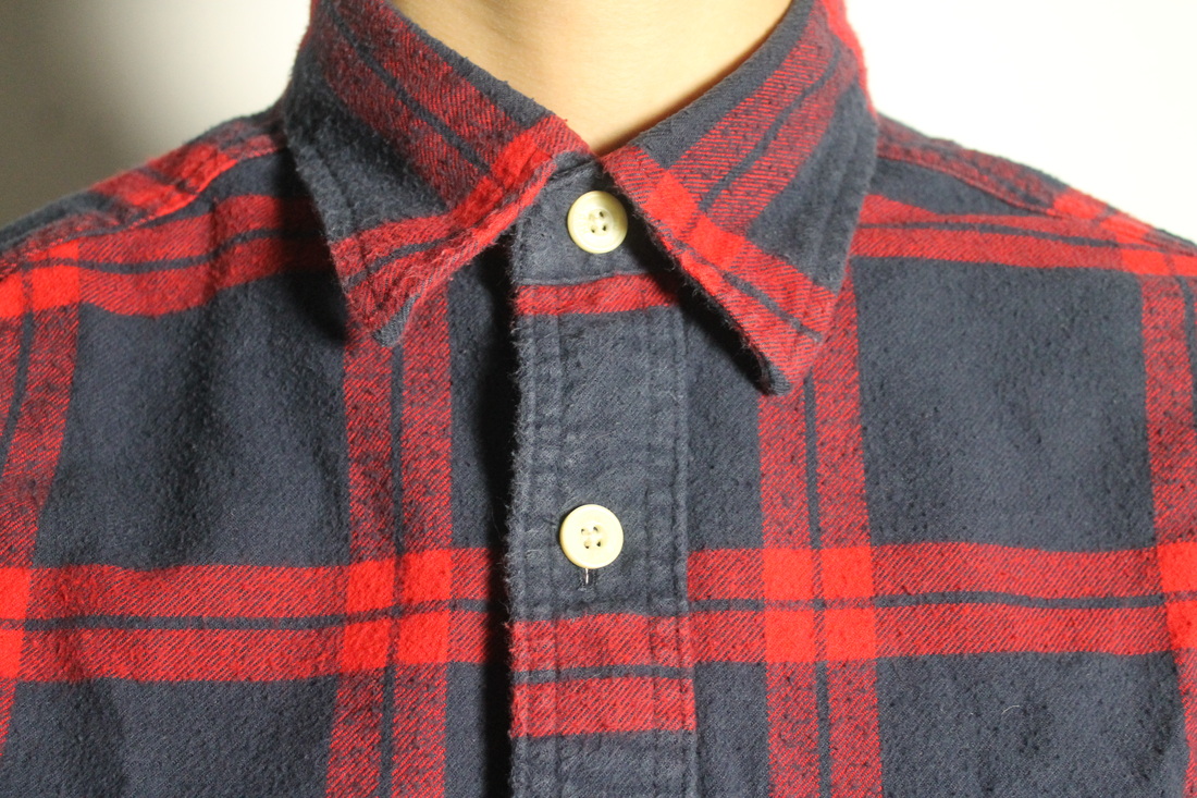
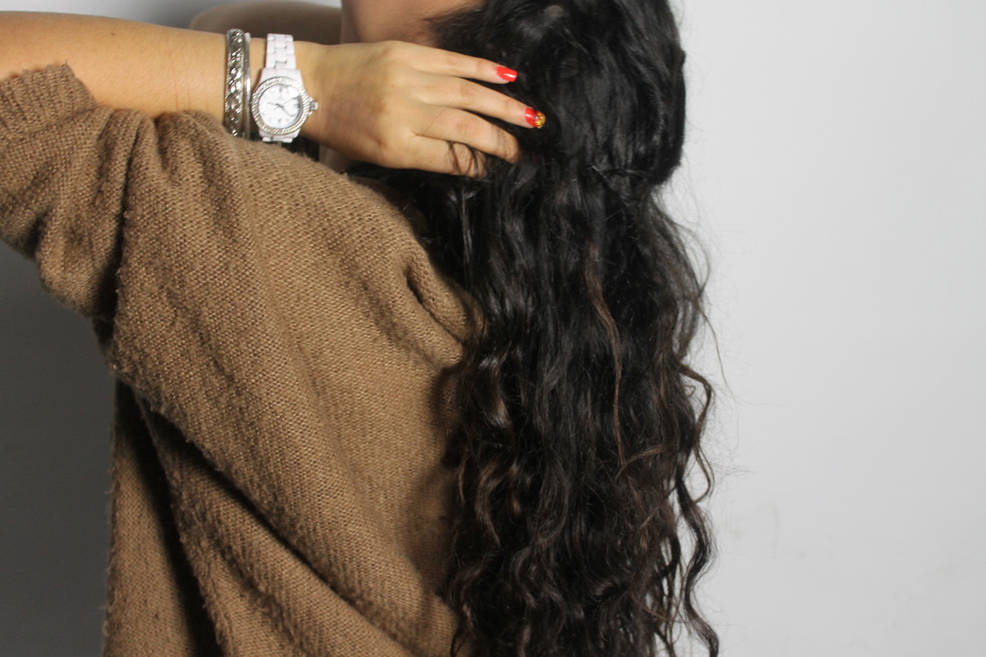
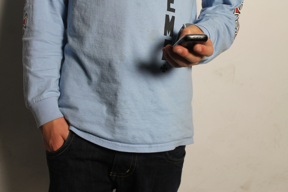
Taken in the studio. Captured images of things that the person is either wearing, typical mannerisms or their features along with a portrait of that person. These specific aspects of each person expresses the difference between each individuals identity; most obviously the difference between being male and female but their natural expressions and their clothing makes it clearer for the observer the type of person they are. Emphasises the concept that we can distinguish a person's identity by their choice of clothing and the way the style themselves relating to their personal style and personal interests that suggest that persons identity.
|
|
|
|
|
|
|
|
|
|
|
|
Poor lighting - only had one light which created a dark shadow on one side of the image. It almost makes the figures look like they are in 3d which ultimately is how you would see them in real life but it does create unnecessary dark black spaces in my image - especially for the close-up images. The layout of the three images is almost formulaic in the sense that you see the two smaller more personal images so an observer would by create this person in their head before seeing the actual front-on portrait.
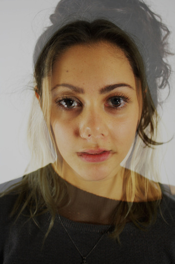
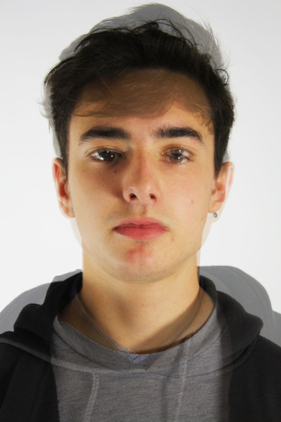
Portraiture Development - Layered portraits
Taken in the studio. A simple close-up portrait of two people then layered on top of one another in photoshop - two people merged together almost creates a whole new person.
Separate raw portraits
|
|
|
|
Combined edited outcome
|
|
I think this was an interesting experiment although lacked something interested or exciting. I liked exploring how you could almost manipulate identities to create a whole new one which was a good exploration of my theme. However against the white background and different clothing look too obviously merged and therefore lacks that wow factor.
Portraiture Development - Identity by appearance
Studio photos, very simple concept, capturing identity by feet and shoes.


The images work well as a set as by maintaining the same angle and composition and presenting them as a group you immediately ask the audience to compare the images and therefore they begin to depict different types of people, different identities. The identities depicted are very much appearance based which I think was a good thing to explore as I think its probably one of the most recognisable traits of identity and how we decipher people nowadays. However, I don't quite think the outcome is attention grabbing enough or particularly engaging. Although they do begin to represent identities, the information given through the photographs of the identities of each person is minimal.
What's next...
I felt from my last experiments I was getting stuck working just in the studio and wanted to take the portraiture elsewhere to create something more visually and conceptually interesting. One thing that I did like about the studio work was in the identity by feet shots the comparison that I created for the audience by using the same composition but alternating the feet. I feel this is a good idea to develop further as by making this comparison you are considering the different types of identities present and deciphering between each one, making each one more prominent in their own way.
I felt from my last experiments I was getting stuck working just in the studio and wanted to take the portraiture elsewhere to create something more visually and conceptually interesting. One thing that I did like about the studio work was in the identity by feet shots the comparison that I created for the audience by using the same composition but alternating the feet. I feel this is a good idea to develop further as by making this comparison you are considering the different types of identities present and deciphering between each one, making each one more prominent in their own way.
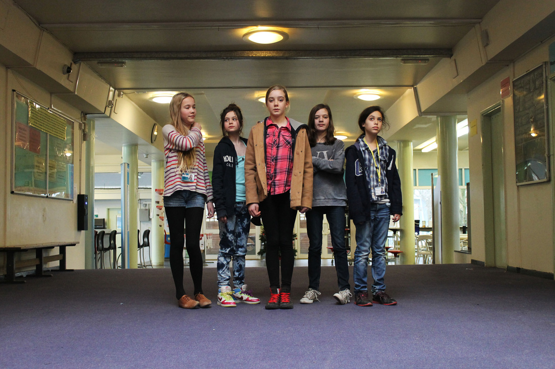
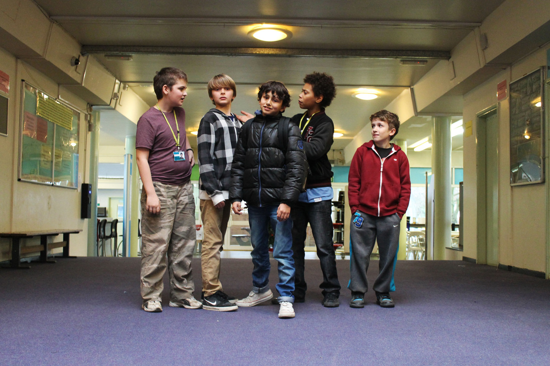
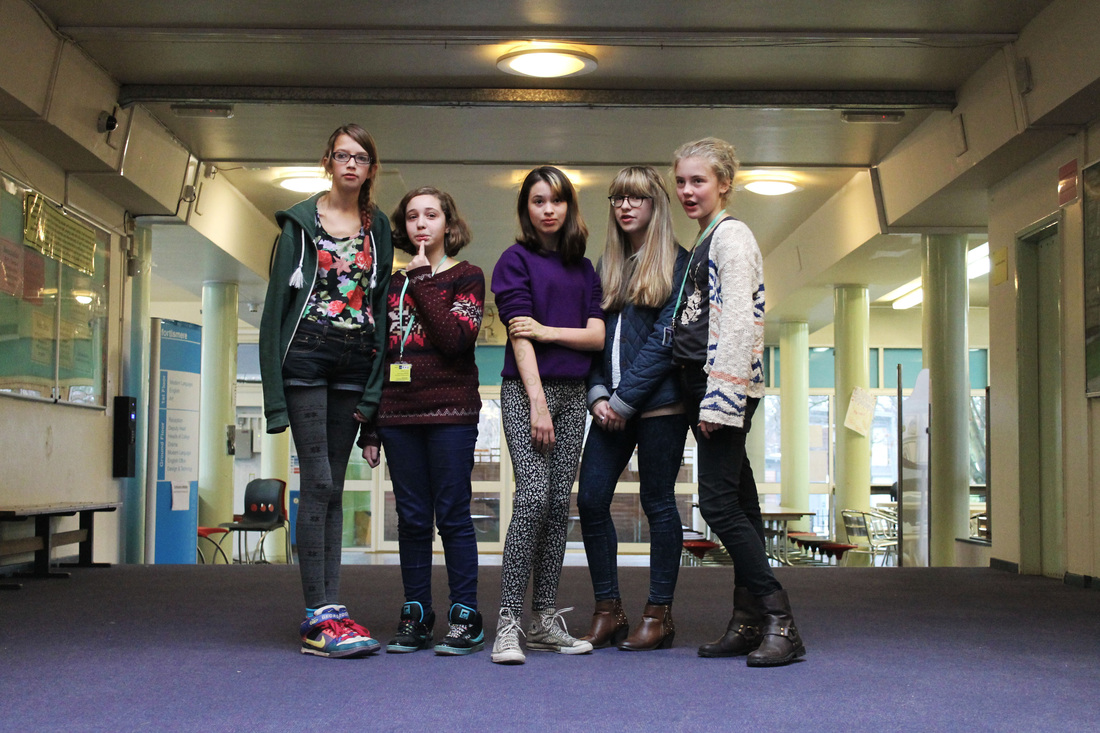
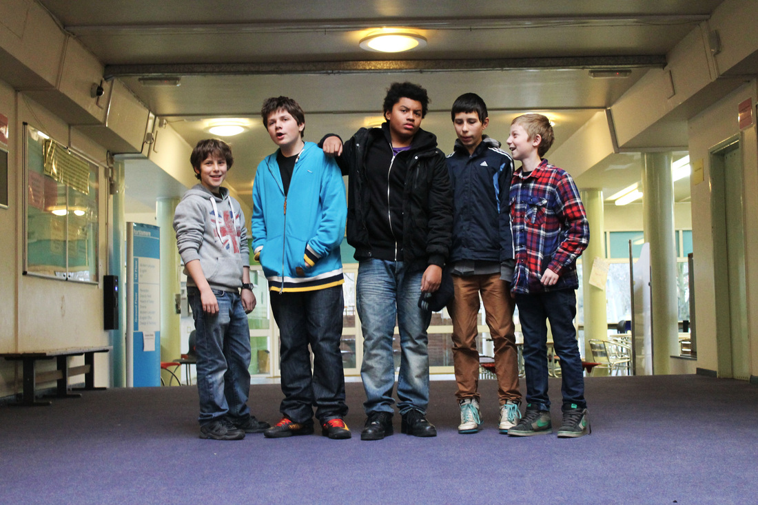
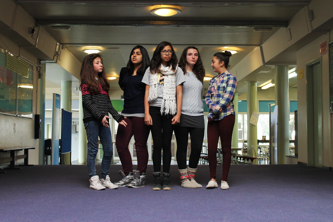
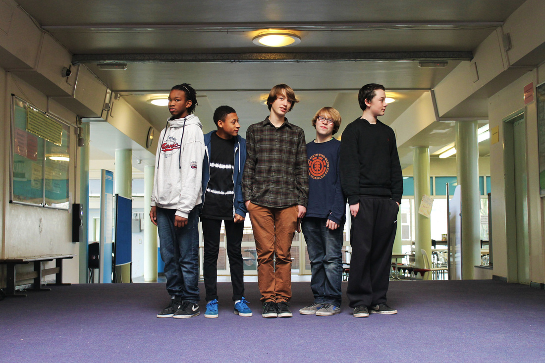
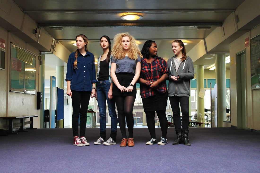
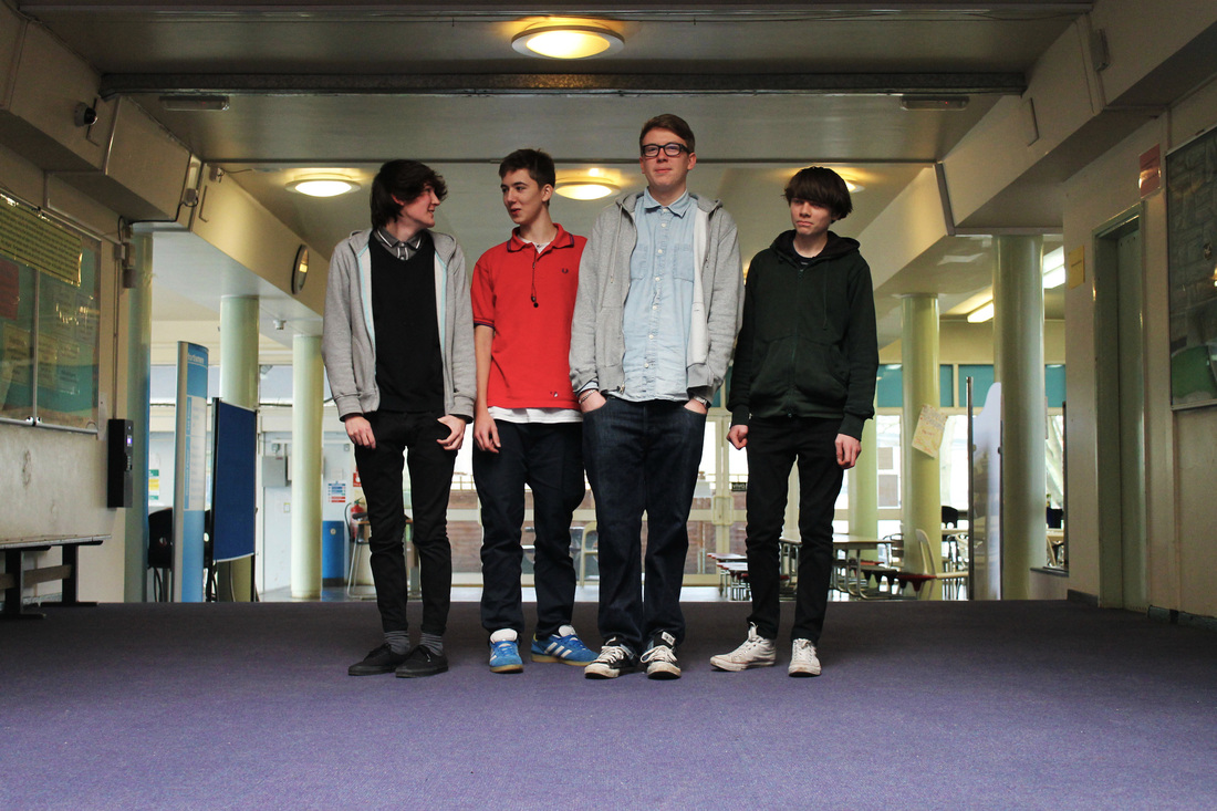
DEVELOPMENT - 'Through the Years'
I came up with this idea when I was thinking back to the evolvement and progression that my friends and I had made from year 7. I feel like secondary school is such a prominent time for growing up and truly begins happening the minute you begin year 7 and I wanted to experiment capturing this on camera. I decided to take the same idea as my previous experiment, the idea of making comparisons, as I felt this would be successful when trying to compare the different year groups at school. I picked a location that would be obvious enough that it was a school and begun shooting 5 random students from a classroom. I came back to the same spot several times to shot other years.
YEAR 7
RAW IMAGES
RAW IMAGES


EDITED OUTCOME
YEAR 8
RAW IMAGES
RAW IMAGES


EDITED OUTCOME
YEAR 9
RAW IMAGES
RAW IMAGES


EDITED OUTCOME
YEAR 12
RAW IMAGES
RAW IMAGES


EDITED OUTCOME
OVERALL ANALYSIS
FORM: Secondary school students through the years. A presentation of the comparisons and transition of their physical appearance as they grow up.
PROCESS: I took these photos gradually over several days, re-visiting the same set-up each time in order to get the exact same composition. I decided to take the images sitting on the floor in order to get a more life size view of the students but also because it looked better in the frame from below and made it clear that it was a school corridor. I placed the students in a line and told them to be completely natural. During the shoot I asked them questions and told them to interact with one another so to get them in a natural state and to not be posing. My one adiment request was that the person in the middle to stand facing me and to look at the camera in order for them to catch the viewers eye when presented. Editing process was minimal, I only enhanced the contrast and slightly brought up the vibrancy as the lighting in the corridor was quite flat and I wasn't able to use studio lights.
CONTEXT: My intentions of this outcome was to show the identity of different school years through physical appearance; clothes, posture, mannerisms etc. I wanted the observer to be fascinated at the evolving identities these students have as the progress between each year. I wanted the photos to be visually interesting and attempted to achieve this through the repetition in set-up. I also did this to evoke a compare and contrast thought within the viewer - by comparing the different years I figured they would have a better understanding of the different identities in each year. I also wanted the viewers eye to look at all the students but be pulled in by the centre student, looking at the camera. I did this because I wanted to maintain my previous idea of the lone figure because I think this catches the viewers eye well.
EVALUATION: As a series, I believe this outcome works very well in portraying identity and is visually interesting. I was very pleased with how the images as a set turned out and I would put that mostly down to the set-up. Not only is a corridor an iconic set-up of a school, but by having this set-up exactly the same in each photo brings more attention to the figures and therefore their identities. By changing the people and not the set-up, widens the range of identities captured and highlights each one more effectively when compared against one another. Another thing I love about the images are the students physicality. By asking them to be natural and by interacting with them, portrayed them in a completely natural light that firstly is effective in showing their identity in the most realistic and believable way but secondly creates a comic aspect to the photos. There is humour in the evolvement of these children and endearment in the how innocent and young the youngest children look to the more confident, mature-looking sixth form students.
PRESENTED OUTCOME
As a presentation for this outcome, I would choose to frame each image separately and hang them in right to left in year order with girls above and the boys below. Although each image share the same setting which hopefully would be recognisable for an observer, the content of each image is very different and is meant to show a stark contrast between not only boys and girls but ages through the years predominantly through only their appearance and demeanour.


If these were to be presented, I would do a simple mount and display them in the way shown above with the years progressing horizontally and the genders separately in order to show the evolvement at it's greatest.
What's Next...
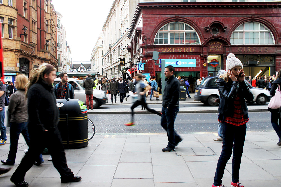
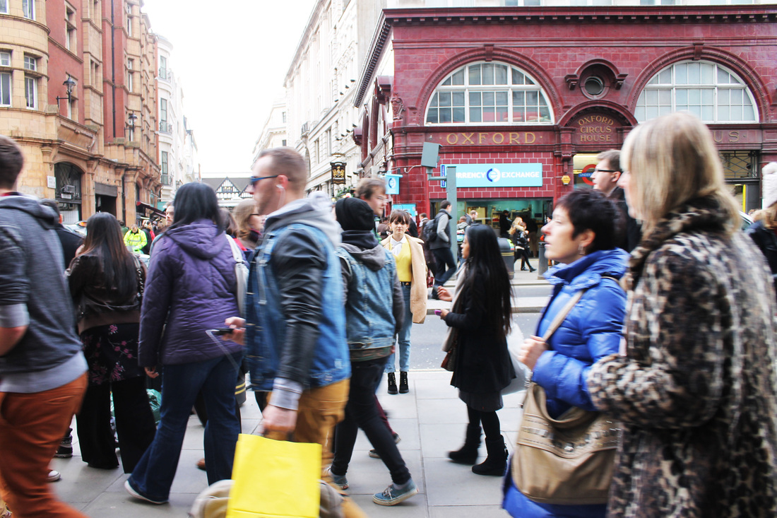
After researching into both of my strands - A Lone Figure and Portraiture - and producing different outcomes to both, I begun to see certain elements of each outcome that shared similar ideas. Throughout my 'School Years' outcome the centre person was looking directly at the camera which caught the observer's eye reminding me of an isolated figure, something that I looked into in my first experiments. Therefore, for a final development idea I decided that I wanted to combine both these strands to create my final outcome to this investigation. The isolated figure was something that really interested me, but I wanted to discover how I could incorporate it into a more fascinating and alternative environment. Taking inspiration from 'School Years' I wanted to see how the isolated figure could be recognised in a busier environment, specifically one with a lot of people. I wanted to explore the effect on a figure's isolation if they weren't isolated; Does it still exert the same vacant and vast atmosphere that it created in my first experiment? Is the sense of their identity more noticeable?
|
Dominic Harris - Portrait of a City: Standing Very Still
|
My first inspiration was taken from Dominic Harris's series, 'Portrait of a City; Standing Very Still'. First of all his choice of setting; the busy streets of London enhanced the feeling of isolation and the feeling of being one identity amongst a city of so many that you get from seeing the isolated figure. Also, the effect of having the isolated figure in focus whilst the movement around them blurred. Not only does this create a more interesting image, something that is visually effective for the audience but also makes the isolated figure stand out of the image more and makes them recognisable to the observer's eye.
|
PHOTOGRAPHIC OUTCOME
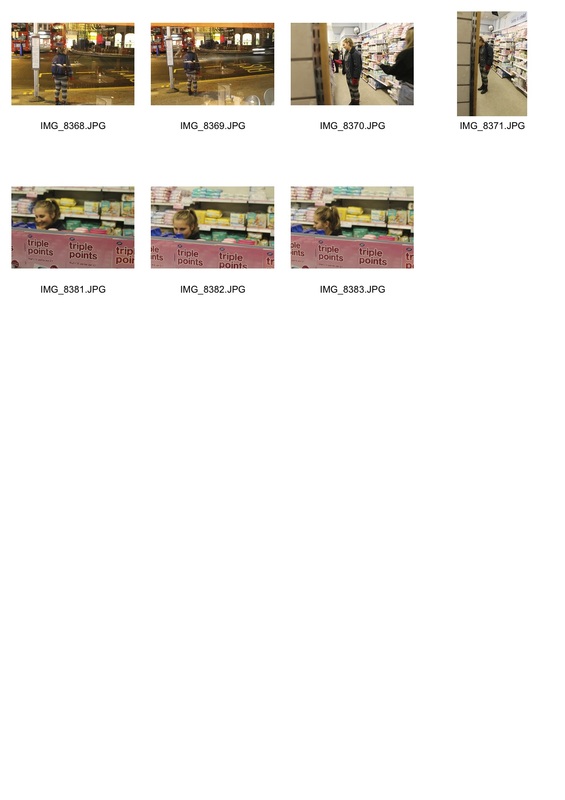
For this outcome, I went to different areas around London that are notably busy and also well known to capture a figure amongst the chaos. My intentions were to take the isolated figure that I explored earlier on in my development and place them in these hectic environments to see whether their presence is still as noticeable and therefore the idea that their identity is one of so many in the world is enhanced. When capturing these images, I used a tripod and took a photo every 2 seconds for several minutes, in order to capture the images I would use in my time lapse but also that worked well as photos on their own. I also deliberately asked my model to where bright clothing in order to have her stand out within the crowds.


I enhanced the contrast on these images in order for the colours within the image to stand out, specifically so that my model would mostly. In some of the images, my model isn't as noticeable than others however I wanted to do this so that if the audience still recognised her in the image I would know that I achieved my intentions.
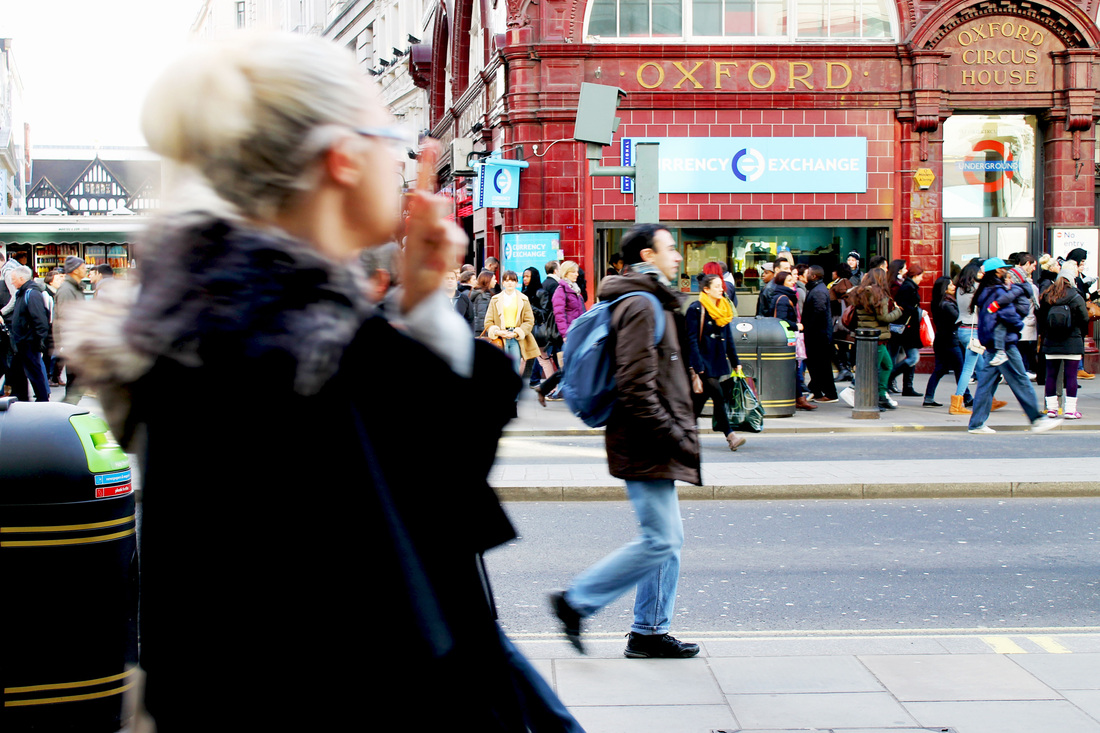
These last three images I had the model placed at different places on the road getting progressively closer to the camera. These were my three favourite images also because I liked how some of the figures were blurred showing the movement of the crowds. Again, I highlighted the contrast in order to make the brighter colours in the images pop out. I also liked the transition of the photos what with how my model gets closer creating this journey type motion also adding a mysterious atmosphere and curiosity within an audience as to who the figure is - relating back to my ideas of identity, specifically isolated identities.
|
OLLIE LARKIN - Lapses in Light
|
Time-lapse photography is a technique whereby the frequency at which film frames are captured (the frame rate) is much lower than that used to view the sequence. Processes that would normally appear subtle to the human eye e.g. the motion of the stars and the sun in the sky, become very noticeable and striking. When I was watching Ollie Larkin's time-lapse video, 'Lapses in Light' I was inspired by the effect it had on the movement of people and vehicles. For my project it enthused me to discover what effect this hectic movement would have on my isolated figure. My intentions were to make her stand out and be more prominent to the audience and I thought that time-lapse photography would do so when combined with the busy streets of London.
|
|
Another example of time-lapse photography, in order to get a more focused understanding of the technique was in The Spice Girls music video for '2 become 1'. The background for each setting used time-lapse photography which I believe made the figures stand out more and created and interesting viewing experience. The chaotic movement of the crossroads and the ice-skating rink inspired me in my creation of time-lapse photography as it highlighted again how the figure almost seems minute in the sense that their identity is 'one in a million'.
|
|
VIDEO OUTCOME
Carnaby Street
Oxford Circus
Picadilly Circus
Trafalgar Square
I spent around five to ten minutes at each setting taking photo's manually every couple of seconds. The video outcome at Carnaby Street worked especially well I feel because the movement of the people walking away and towards the camera was more interesting and made my figure stand out more. My outcome at Trafalgar Square was more independent than the other settings because of the angle I shot it from. Being above the action I thought was really interesting as an observer would have to find her amongst the hectic crowds and enhanced my concept of identity being 'one in a million'. Her bright clothing highlighted her appearance specifically in these shots.
Difficulties that I faced when capturing these videos were the setting actually being over crowded as at times crowds of people would unintentionally be standing directly in front of my model for several minutes. Similarly, a problem on Oxford Street I faced was traffic specifically buses that would also block my model for several minutes. However, I do feel these difficulties make my outcome more realistic and if anything make the presence of the figure more subtle and creates more interest for the audience and for me as to where the eye focuses.
Difficulties that I faced when capturing these videos were the setting actually being over crowded as at times crowds of people would unintentionally be standing directly in front of my model for several minutes. Similarly, a problem on Oxford Street I faced was traffic specifically buses that would also block my model for several minutes. However, I do feel these difficulties make my outcome more realistic and if anything make the presence of the figure more subtle and creates more interest for the audience and for me as to where the eye focuses.
EDITED VIDEO OUTCOME
Also whilst I was at these different locations, I took videos on my camera of the figure. I tried to use the setting and environment of each location to its full advantage and attempted alternative ideas of capturing not only the figure but the busy crowds that surrounded here. My favourite being the fountain at Picadilly Circus where people swarmed around the fountain to take pictures.
I edited the video in iMovie and added music, Awolnation's 'Sail'. For the filmed parts of the video I separated and cut them in order to get different speeds. I wanted the whole video to maintain the same pace that the time-lapse video's had but I wanted to predominantly highlight the figure and on-lookers who caught the cameras eye.
I really like my outcome and think the whole piece works really well however, the transition from each setting could have been improved if I had had a more clear mindset on how I wanted the whole piece to look like. Also I think I could resolve the ending better and make the video come to a conclusion at the end.
I really like my outcome and think the whole piece works really well however, the transition from each setting could have been improved if I had had a more clear mindset on how I wanted the whole piece to look like. Also I think I could resolve the ending better and make the video come to a conclusion at the end.
FINAL DEVELOPMENT - Brick Lane
Further video outcome - Brick Lane
The specific development I wanted to take on was, trying to obtain more transition in between each stop motion video. By sticking to the same location, I was hoping to achieve this however I enhanced it even more by having the model in each time lapse move closer to the camera in where she is standing. Instead of her being blatantly obvious to the camera each time, I wanted an observer to slowly recognise the figure that is the only person staring right at them. The other aspects of my previous videos, such as the method I wanted to keep the same.
I used the exact same method for these time-lapse's, using a tripod and simply taking a picture every few seconds for 5 minutes or so. The setting is obviously less recognisable than my previous video's however what I like more about these ones, especially the first few, is that you really feel like you are on the street, watching all these people walk by. What with being a much busier area because of its smaller proxemics, the mass amount of people feels more overwhelming and therefore is more realistic. However, in the first video the street is so busy that with my model standing against the wall on the other side of the street, she is hardly recognisable because of the herds of passersby. Another thing that would have worked better that works better in my previous videos was the clothing on the model. The black coat she is wearing makes it harder for her to stand out unlike the bright brown one previously. Although a set back it also creates more of a challenge for me as to whether the transitions in my developed film have been effective in still making the viewers eye gravitate towards the lone figure.
EDITED VIDEO OUTCOME - FINAL
To my final video outcome, I added music like before this time, Imagine Dragons, 'Radioactive'. I thought this music worked well with the video as the prominent beat meant that I could link the video to the music effectively and it be an improvement to the outcome not just something for the video to singalong to. I also added film clips that I had took that day as well, and changed the pace in parts to make it fit in with the ambience of the setting and music and to also make the figure at times more prominent to the observer. Visually, I enhanced the contrast in the images in order for them to look more sharp and the figure to really pop out of the screen but also I think it adds a gritty, harsher tone/colouring to the video that corresponds well to the street setting of the video. I edited the video through iMovie.
Further video creations...
After thoroughly enjoying creating my final videos in my coursework project, I decided to experiment with stop motion and general movie making more and create a short film of my holiday to Cornwall in the Spring of 2013. With the success I had with how the stop motion looked with moving people, I wanted to see how it would work with moving vehicles, especially on the motorway. I enjoyed more capturing the video and overall I wanted to grasp a sense of the ambience or the journey and the idea of travelling. I put the film to music, Of Monsters and Men's, 'Little Talks' the Bombay Bicycle Club Remix
