Portraiture -
Researching Photographers
David Seidner


David Seidner (born 18th February 1957) was an American photographer known for his portraits an fashion photography. He died of complications from AIDS on Sunday, June 16th 1999. David Seidner was nineteen when his first cover picture was published and twenty-one when the first of many solo exhibitions of his photographs was shown in Paris. Over the following 20 years he created both "commercial" and "artistic" work. In the 1980s he was under a contract with Yves Saint Laurent. His commercial work included fashion shoots for the French and Italian editions of Vogue, Harper's Bazaar, Vanity Fair and The New York Times Magazine, and advertising campaigns for Emmanuel Ungaro, Lanvin, Christian Dior, John Galliano and Bill Blass. The artistic side encompassed shows at the Pompidou Centre and La Maison Europeenne de la Photographie in Paris, the Whitney Museum in New York, and the publication of several books. In 1986 he was commissioned by the Musée des Arts de la Mode in Paris to photograph costumes from its collection. His signature imagery from that period included photographic fragments, paint, shards of glass and reflections. His influence then was the music of John Cage.
Digital Response
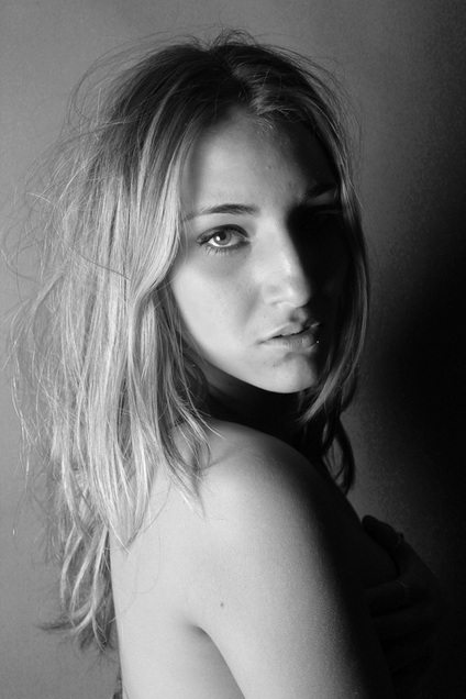
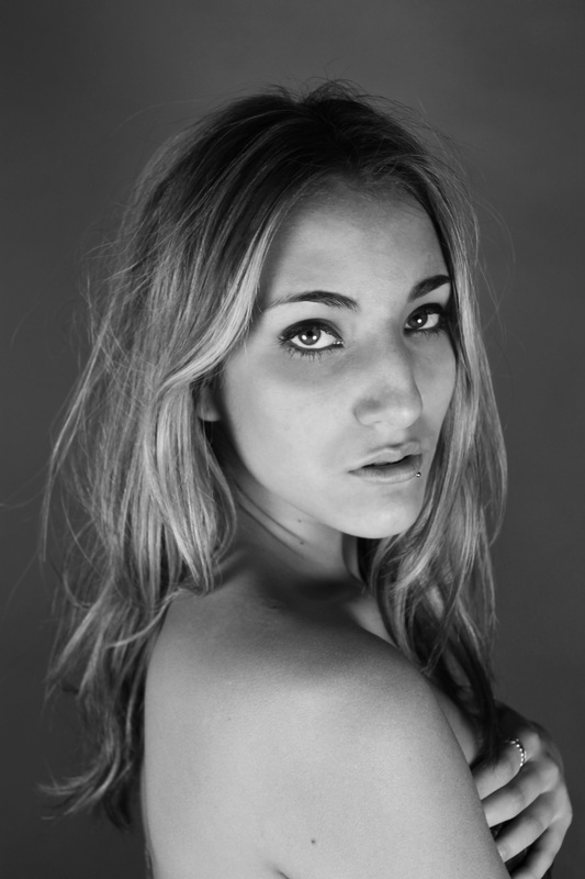
I began with developing the idea of using light in the studio. Using shadows and a black backdrop to create a half lit up face, I managed to produce an accurate response to some of David Seidner's photographs. I furthered this by using a bright light to create silhouettes and different interpretations of using studio lighting. I decided not to use photoshop to edit these images as I wanted to keep them very natural and show the accurate effect of how light can be used to create shadows.
Evaluation: The light hitting the side of my models face increased her natural facial features and complexions and also represented the work of David Seidner well. Variety within where my model is placed according to the direction of light shows my personal interpretation to Seidners work. As a first experiment this shoot was useful in getting to grips with studio lighting. However, I feel the photos lack substance and aren't particularly original. If presented I feel these photos wouldn't particularly pop out and development of this concept is sparse.
Dominic Harris
London based photographer whose work ranges from advertising, portraits, corporate, editorial, architecture, music, graphics, stock images and art editions. Example of light pen portraits:
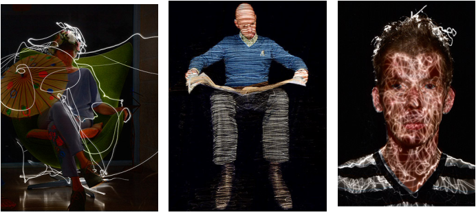
I furthered the idea of using light as a way of creating interesting effects and researched into light painting. The photographer Dominic Harris was a perfect example of someone who uses a slow shutter speed and laser pens to create this dynamic concept. In order to achieve successful light painting photographs I turned my camera to the bulb setting which meant the shutter was open for as long as I held the shutter button down for. This meant that I could use the laser pen to draw on my image whilst I held the shutter down to the time needed.
Digital Response
Using the laser pen I created scenery's around my model and used a shiny, metallic material to reflect the light onto the floor and walls. The reflection was like you were underwater and produced some really interesting effects.
Evaluation: These photos are exciting and have an element of humour. Creating different settings around the model was interesting and experimenting with different uses of light on the manual setting opened my eyes in ways I could develop this concept. I would also take these photos against an empty black wall so that no objects would be lit up. I would choose not to use these photos as a final outcome because I feel that they aren't particularly professional and don't show a great deal of thought or concept.
. . .
Picasso also used light painting in some of his work. He managed to capture the movement of the light that he was creating in the picture but with himself not distorted or blurred in the photo.


Francesca Woodman
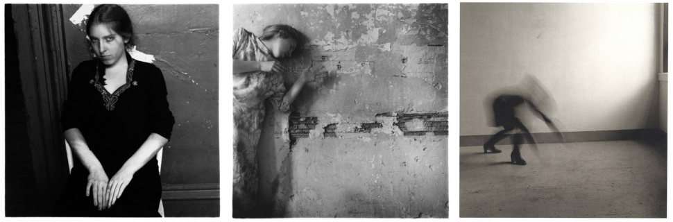
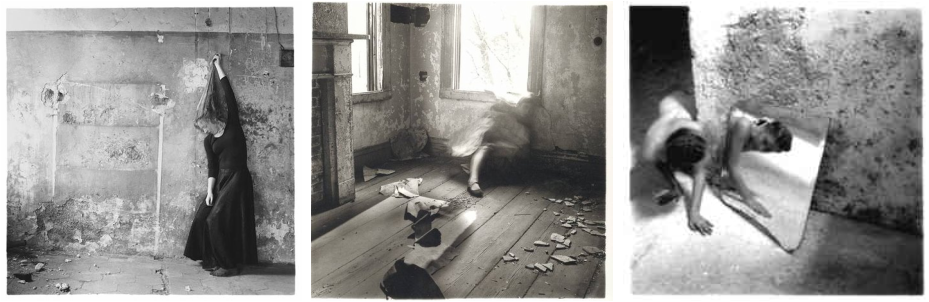
Francesca Woodman was an American photographer best known for her black and white pictures featuring herself and female models. Many of her photographs show young women who are nude, who are blurred (due to movement and long exposure times), who are merging with their surroundings, or whose faces are obscured. Her work continues to be the subject of much attention, years after she committed suicide at the age of 22.
Digital Response
From my previous digital responses I decided to develop further two ideas; different uses of light and ways in using it and the effect created from using a slow shutter speed. Combined with the inspiration of Francesca Woodman's photos, I created these set of disturbing, dark photos. My model was wearing very plain, neutral coloured silk nighty with a knit jumper and pale make up with dark eyeliner to give her definition. I choose this look because it was very scary and sinister and corresponded well with my concept. The setting was also very important in order to bring alive the character I had created. Seeing Francesca Woodman's dirty, old setting gave me the idea to take the photos down in my cellar, which was similarly costraphobic and creepy. The first photos taken outside the entrance to the cellar, I used two different torches to light up the scene. Both lights were cold and bright making the images quite chilling. The shutter speed here was at 1/8 of a second. As I moved inside I used the inside light that was in contrast much warmer and had an orange tinge. The setting speaks for itself in being forbidding and terrifying so I thought that by using no other light sources inside, this would really convey the full effect of the setting. One idea that really sparked from Woodman's work was how in some photos her models look ghost-like and she almost blurs them out of the image. In order to achieve this effect myself I put my camera on the manual setting and changed the shutter speed to bulb which meant that I could completely control the time in which the shutter was open for. As you can see in my previous work this is what I did when using the laser pens. However, instead of keeping the model still, I figured if they moved then their body would be blurred in the photo. This created the ghost-like effect and really emphasised the twisted, disturbing aspect of my photos. In future though, when using this idea, I would definatly make sure I had a tripod so that the background would be sharper and not so blurred, as the slightest movement when holding the camera on the bulb setting will blur the image.
Evaluation: I maintained the idea from my previous strand of using alternative sources of light e.g. laser, torches in order to light up the set. Through the creepy setting, my model's chilling, dark facial expressions and body language along with the use of costume and make-up brought this photo shoot to life and created a strong concept. I used a variation of different angles; with my camera and torch, in each shot in order to create a different perspective and use the full potential of the set. I controlled the amount of light being captured by altering the shutter speed. I used the bulb setting once again on the last two shots in order to blur and distort my model's face whilst she shook her head and screamed so she would look strangulated and frightening. Overall I thought these photos had a strong concept and developed the ideas I had worked on in my previous experiments well. When choosing a final portraiture outcome, I would not choose these images for the reason that I feel they would not stand out and be striking to the eye when mounted in a frame.
Woodman Development
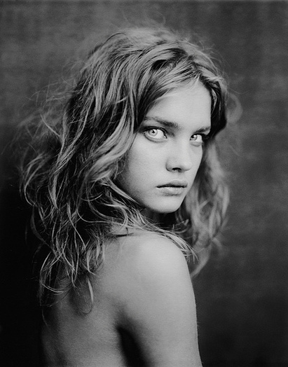
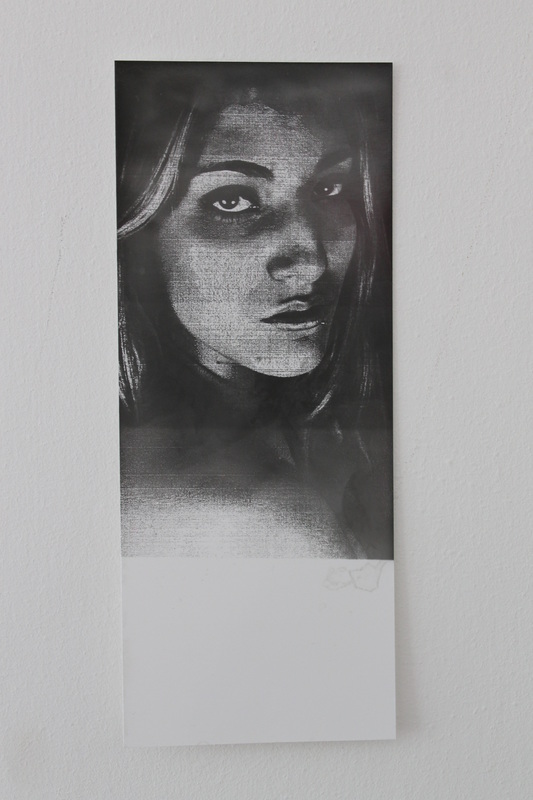
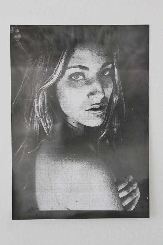
Paolo RoversiPaolo Roversi (born 1947) is an Italian-born fashion photographer who lives and works in Paris. In 1970 he started collaborating with the Associated Press: on his first assignment, AP sent Paolo to cover Ezra Pound’s funeral in Venice. During the same year Paolo opened, with
his friend Giancarlo Gramantieri his first portrait studio, located in Ravenna, via Cavour, 58, photographing local celebrities and their families. In 1971 he met by chance in Ravenna, Peter Knapp, the legendary Art Director of Elle magazine. At Knapp’s invitation, Paolo visited Paris in November 1973 and has never left. HIs darkly, romantic, beautiful and ethereal portraits are some of my favourites photographs. Roversi has worked for many different fashion magazines, such as Vogue and Elle and worked with some of the most famous models, including Kate Moss, Naomi Campbell, Gemma Ward and in the photo to the right, Natalia Vodianova. Plus, Roversi has also worked for many different fashion labels including, Giorgio Armani and Vera Wang, which achieves his high recognition as a fashion photographer. Paolo Roversi's work inspired me for my development from Francesca Woodman inspired photographs. Both capture a very dark, sinister mood however, similiar to Roversi's work, I wanted to concentrate on portraits of the model to enhance the beauty. I experiemented with a range of angles but ultimately loved the simplicity and beauty of the straight-on head shot like Roversi's iconic photographs. |
|
Digital Response

|
Roversi EvaluationA strong response to Roversi's work, mirroring his dark and mysterious photographs. An authentic, raw atmosphere is present in the photos which makes them captivating and intense. Clear development from Woodman's work as the chilling, dark atmosphere is followed through in the facial expression and intensity. Played around with angles and different lighting options; i.e. shining studio lighting onto one side of the set to show variation and personal interpretation. Edited into black and white and sharpened to create dirtier, more grainy photographs. Compared to Roversi's work, the photos aren't as grainy and gritty as i would have liked, therefore development using the dark room facility could achieve this.
|
Roversi Developement
I wanted to achieve a more grainy photo and create my own spin on Roversi's work. This is my step by step method:
|
1. I edited the chosen photo into a negative version using photoshop and printed it out onto photographic paper at an A5 size.
|
2. Transferred the photo onto a transparent gloss paper so that I would be able to reflect the image onto photographic paper using the dark room facilities.
|
3. Placed my negative image from previous step and placed over photographic paper and exposed to light. Began with a test strip so to see the best amount of time to expose the image to light.
|
4. From the use of the test strip, I exposed the image to around 3 seconds of light - very short amount of time because the image is slightly over exposed - and then followed through with the developing process.
|
Roversi Development Evaluation
Strong, noticeable improvment in texture of the photo - grainier and dirtier which enhanced the dark, etheral, rawness of the photo reflecting on Roversi's work. Further development would be by expanding the size of the photo by using a larger piece of photographic paper pinned to a dark wall and light shone using a projector. For this, the photo would have to be especially in focus to avoid pixelation. When attempting this idea, because the image was very dark the light had to be shone for an extremely short amount of time or else would be over exposed and appear black.
Overall strong outcome to Woodman and Roversi's work and fluid development to my final piece of this strand.
Overall strong outcome to Woodman and Roversi's work and fluid development to my final piece of this strand.
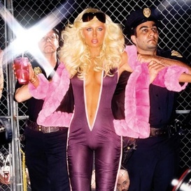
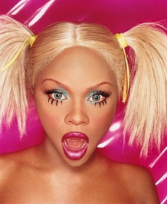
David Lachapelle
|
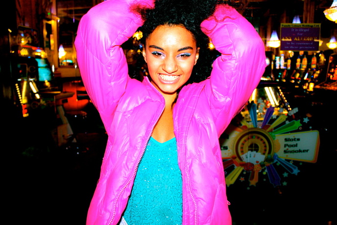
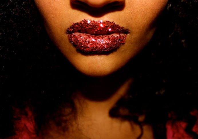
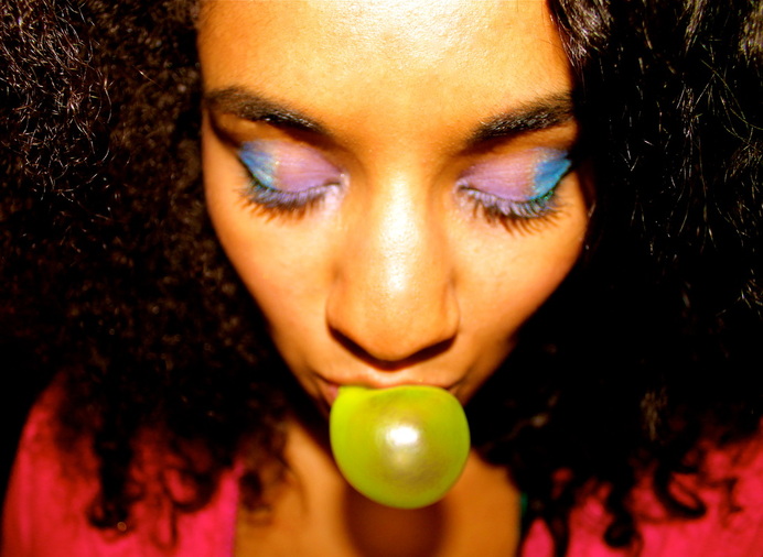
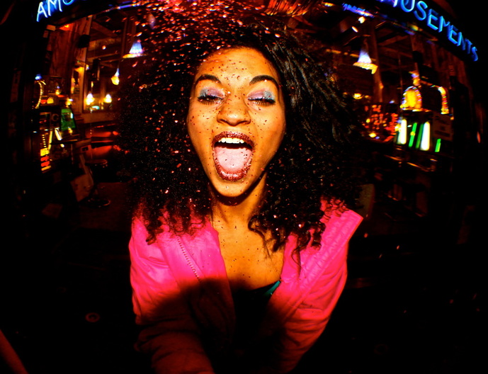
My next strand was inspired from the work of David Lachapelle. He is a fashion photographer who uses a range of bright colours, specifically pinks in order to create fluorescent, flashy photos. I enhanced this concept by taking these photos in front of an amusement arcade, an obviously bright, vibrant setting and used specifically colourful costume and make-up in order to create my own interpretation of David Lachapelle's work. Furthermore, I used a fish eye lens so that I could capture a wider, more vast area of the set.
|
|
Fashion Photography - Amusement Arcade


Evaluation: These photos are extrovert, bright and full of life. They incapsulate the essence of David Lachapelle's work but also maintain my own ideas and have a coherent concept throughout. The use of props; glitter, lollipop and bubblegum and costume; hot-pink coat with contrasting sequin green top aided these photos in enhancing their vibrancy and luminosity. The fish eye lens worked well in exaggerating the model's facial features which reflected my concept that the pictures were to be very out there and striking. Furthermore, by editing these images by increasing the colour, altering the exposure/contrast/saturation slightly and adjusting the temperature level I was able to intensify the photos.
Final Portraiture Outcome
|
|
|
|
I chose these set of photographs as a final portraiture outcome because I feel they are the strongest and will look the more effective when presented. I would use two separate frames and mount the two sets of images onto each. I felt that out of all the photos, these images all complimented each other perfectly but still showed a range of the different perspectives, lenses, props and atmospheres these photos create. I decided to crop these images slightly just to centre them so that they would be level and a tighter crop would focus on the model but still make the background visible. When mounting these photos I would use a simple mount onto a white background and expand these pictures to 18" x 12" inches so that these photos are eye catching and really exaggerate the colours.
